

Design comparison

Solution retrospective
I will be glad to know your feedback thanks in advance ^-^
Community feedback
- @NehalSahu8055Posted over 1 year ago
Hello Coder 👋.
Congratulations on successfully completing the challenge! 🎉
Few suggestions regarding design.
➨ Replace height with min-height in your .parent to fix background issues and use flex or grid to properly center the card don't use margin or padding for the same.
➨ Remove
paddingsfrom the.parentas this will not dynamically center the card .➨ To properly center the container.
- USING FLEXBOX
body{ min-height: 100vh; display: flex; align-items: center; justify-content: center; }- USING GRID
body{
min-height: 100vh;
display: grid;
place-items: center;
}
➨ Use
Semanticsfor the proper design of your code.<body> <header> <nav>...</nav> </header> <main>...</main> <footer>...</footer> wrap up `.attribtution` div inside your footer. </body>-
Every site must have one
h1 elementdescribing the main content of the page. -
So, Add a
level-one headinginstead ofptoimprove accessibility. -
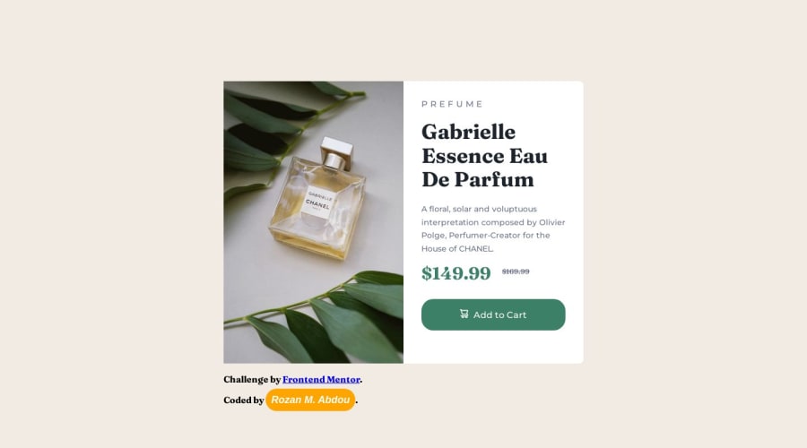
<h1>Gabrielle Essence Eau De Parfum</h1> -
It would be better if you use source media for switching to screen sizes(mobile or desktop) for image.
<picture> <source media="(min-width:800px)" srcset="yourimage.jpg"> <img src="yourimage.jpg" alt="description"> </picture>-
For
non-decorative imagesgive meaningful and descriptive alt likealt= "Gabrielle Chanel Perfume bottle surrounded by leaves.". -
Use
responsive units(rem, em, %)from next project. Explore respective use cases on google. -
Replace
widthwithmax-widthto make your card more responsive.
link.
I hope you find this helpful.
Happy coding😄
Marked as helpful0

Please log in to post a comment
Log in with GitHub
Join our Discord community
Join thousands of Frontend Mentor community members taking the challenges, sharing resources, helping each other, and chatting about all things front-end!
Join our Discord