Design comparison
Solution retrospective
I know that your time is limited and important, but it's going to mean a lot if you leave a feedback down below. Thanks! :)
Community feedback
- @pikapikamartPosted almost 3 years ago
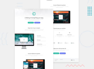
Hey, awesome work on this one. Right now, the layout is much shorter than the design so have a note about that one. The desktop layout looks fine for now but needed those spacings. Resizing the site, the content in the first section is overlapping the left-side image. For mobile state, the first-section image is being hidden by the screen slightly, the 3 icons-section content is too squished and the footer grey color is not occupying the full width.
Some suggestions on the site would be:
- On your
bodytag, you should use this for thebackgroundto work properly:
background: url("../images/bg-header-desktop.png") no-repeat center top- I just noticed, when using dev tools at the bottom, your images resizes really small, suspecting vh unit usage in here.
- For this one, I would prefer the
headeronly wrapping the website-logo and not the hero-section.headertypically wraps logo and navlinks of the site, hero-section belongs to themainbecause you want theheaderto be reusable for other pages so including only necessary. - Remember that a website-logo is one of the meaningful images on a site so use proper
altfor it. Use the website's name as the value likealt="clipboard". - Changing those
sectiontags into just usingdivsincesectionas landmark is not informative enough unless they are labelled byaria-labelledbyattribute. - Use
remvalue for theimgheightinstead ofvhsince it is not consistent. - Use a more descriptive
altfor the images. For example on the computer image, you can use likealt="clipboard application on a computer". - For the content of the right side of the computer image, it would be great to have a
divthat wraps a singleh3andptag so that it won't clutter the markup. Isolating related contents. - For those 3 icons they only act as decorative. Decorative images should be hidden for screen-reader at all times by using
alt=""andaria-hidden="true"to theimgtag or onlyaria-hidden="true"if you are usingsvginstead ofimgtag. - Only use descriptive
alton images that are meaningful and adds content to the site otherwise hide the image for screen-reader users. - When using a heading tag, make sure you are not skipping a level. If you use
h4then make sure thath1, h2, h3are all present before it's section.
FOOTER
- Same with the company logo, use a more proper
altvalue. - Those 5 links should be using a link
atag. You can nest them inside of aulinside of anav:
nav aria-label="footer"
  > ul
    >li
      >a
Have 5
litags since there are 5 links.- Those social-media links could be inside a
ulelement since those are "list" of links. - Each
atag that wraps the social-media icon should have eitheraria-labelattribute orsr-onlytext inside it, defining where the link would take them. For example, you should usefacebookas the value if the link would take the user to facebook. - Social-media image should be hidden since it is only a decorative image so use
alt=""andaria-hidden="true". - Lastly, checking always for different screen-sizes when you are coding the site. For example, where the layout is too squished for mobile state, always check before going into live-preview of the site:>
Aside from those, great job again on this one.
Marked as helpful1@VasincPosted almost 3 years ago@pikapikamart I'm so grateful for taking so much of your time just to check my project. Really appreciate this <3 Love and peace for you, bro. Imma really take in consideration what you said, it would really help me out :)
1 - On your
Please log in to post a comment
Log in with GitHubJoin our Discord community
Join thousands of Frontend Mentor community members taking the challenges, sharing resources, helping each other, and chatting about all things front-end!
Join our Discord
