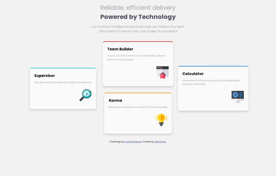


Design comparison
SolutionDesign

Solution retrospective
What are you most proud of, and what would you do differently next time?
I'm proud of how the grid layout was used to archive the challenge requirements. I could understand better the Grid concepts and their usage for different designs.
What challenges did you encounter, and how did you overcome them?I started with building for Desktop before the mobile, so converting the code to mobile was a bit challenging but I was able to figure it out at the end.
Community feedback
- @alaa-mekibesPosted 3 months ago
You did it 🎉 just a few points to fix :
- Never Leave the alt Attribute Blank
Always provide a meaningful alt description for images. This improves accessibility and contributes to better SEO.
- center your design using Flexbox :
body {
    /* 3. Add accessible line-height */
    line-height: 1.5;
    /* 4. Improve text rendering */
    -webkit-font-smoothing: antialiased;
    font-family: 'Poppins', sans-serif;
    background-color: HERE USE COLOR VARIABLE;

display: flex;
justify-content : center;
align-items : center;
min-height: 100vh;
}
min-height: 100vhIs to get full page.- Your solution is not responsive on mobile i think if you change the width on media query to
max-width: 768pxwill fix the problem.
Keep up the incredible work, your dedication is inspiring!
Marked as helpful0

Please log in to post a comment
Log in with GitHub
Join our Discord community
Join thousands of Frontend Mentor community members taking the challenges, sharing resources, helping each other, and chatting about all things front-end!
Join our Discord