

Design comparison

Community feedback
- @elvisEspinozaNPosted 4 months ago
Your HTML structure is clear and uses semantic tags like <section> and <h1>, which improves accessibility. Great job! One small improvement could be using <article> instead of <div class="card-content"> to align with best practices for representing independent content.
The solution is accessible, but adding aria-labels or improving alt text for images (e.g., "Portrait of Greg Hooper" instead of "my pic") would make it even better.
The layout looks responsive, and the media queries work well for smaller screens.
Your CSS is well-organized with custom properties in :root and clear class naming.
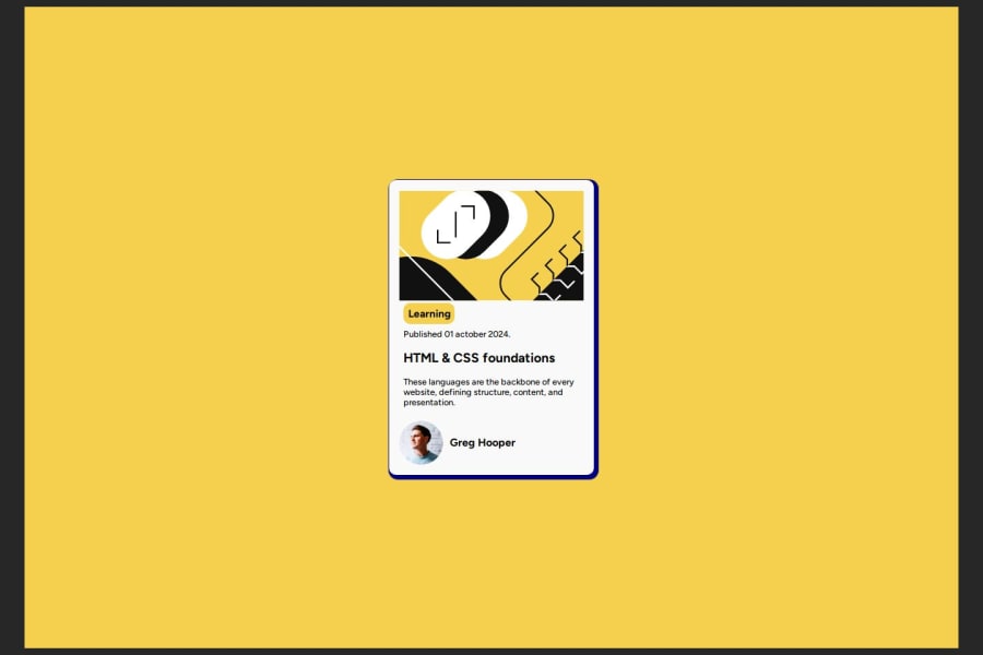
The solution is very close to the design, but the sizing looks slightly off in some areas, such as the card's width.
0

Please log in to post a comment
Log in with GitHubJoin our Discord community
Join thousands of Frontend Mentor community members taking the challenges, sharing resources, helping each other, and chatting about all things front-end!
Join our Discord