Not Found
Not Found
Not Found
Not Found
Not Found
Not Found
Not Found
Not Found
Not Found
Not Found
Not Found
Not Found
Not Found
Not Found
Not Found
Not Found
Not Found
Not Found
Not Found
Not Found

Submitted

Responsive Design 3-column-preview-card-component-main HTML & CSS

itzjter 120

@itzjter

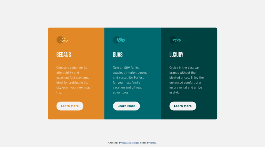
Desktop design screenshot for the 3-column preview card component coding challenge

This is a solution for...

  • HTML
  • CSS
1newbie
View challenge

Design comparison


SolutionDesign

Solution retrospective


Heyy! I'm open to any suggestion that can help me to grow as developer, please :) Thank you! Have a great day ^^

Community feedback

PhoenixDev22 16,950

@PhoenixDev22

Posted

Hello @itzjter ,

I have some suggestions regarding your solution:

  • For any decorative images, each img tag should have empty alt="" (as you did )and aria-hidden="true" attributes to make all web assistive technologies such as screen reader ignore those images .

  • you can add a <h1> with class="sr-only" (Hidden visually, but present for assistive tech).and use <h2 > instead of <h1 >this helps search engines better understand the primary subject matter of each page,


.sr-only {
	border: 0 !important;
	clip: rect(1px, 1px, 1px, 1px) !important;
	-webkit-clip-path: inset(50%) !important;
		clip-path: inset(50%) !important; 
	height: 1px !important;
	margin: -1px !important;
	overflow: hidden !important;
	padding: 0 !important;
	position: absolute !important;
	width: 1px !important;
	white-space: nowrap !important;            
}

  • swap the buttons for anchor tags. Clicking those "learn more" buttons would trigger navigation not do an action so button elements would not be right.

  • Use footer for the attribution.

  • border-radius and overflow hidden to the main container(that wraps the three cards.

  • Never use px for font size

  • It's rarely ever a good practice to set height on the element Let the content dictate how tall something needs to be.remove height on the component , it is not needed and will only ever cause bugs. Let the height of the component be dictated automatically by the browser - it will be added up height of the cards contents, padding, and any vertical margins on that content.

  • an explicit width is not a good way . Remove the width from component and change it to max width instead for the card.

Hopefully this feedback helps

Marked as helpful

1

itzjter 120

@itzjter

Posted

@PhoenixDev22 yess it helps, I will do it assap! Thank you very much :)

1
Naveen Gumaste 10,460

@NaveenGumaste

Posted

Hay ! itzjter Good Job on challenge

These below mentioned tricks will help you remove any Accessibility Issues

-> Add Main tag after body <main class="container"></main>

-> Learn more on accessibility issues

If this comment helps you then pls mark it as helpful!

Have a good day and keep coding 👍!

Marked as helpful

1

itzjter 120

@itzjter

Posted

@Crazimonk thank you ^^

0

Account Deleted

Hi there 👋

Congratulate on finishing your project 🎉. You did a great job 🔨

I give some suggestions that I hope help you take your project design to the next level 📈.

  • There is some issue when you hover over the button. To fix this change the code to this on line 136 in CSS transition: all 500ms ease-in-out;

Happy coding ☕

Maqsud

Marked as helpful

1

itzjter 120

@itzjter

Posted

@maqsudtolipov Thank you! I will ^^

1

Please log in to post a comment

Log in with GitHub
Discord logo

Join our Discord community

Join thousands of Frontend Mentor community members taking the challenges, sharing resources, helping each other, and chatting about all things front-end!

Join our Discord