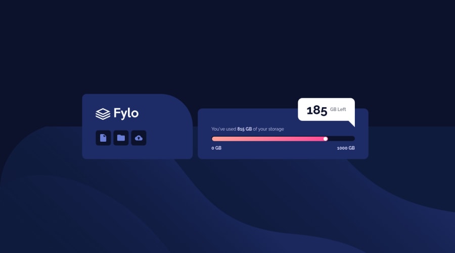
Design comparison
Solution retrospective
A quick exercise to practice what I have learned over the past weeks of becoming comfortable with designing responsive sites. So far, I'm pretty happy with the results, I was able to accomplish the design and without having much bumps in coding it. I just don't know if I did the progress bar properly. At first, I thought it was a range input but looks like it was a progress bar when I thought about it. Any feedbacks are welcome 😄.
Community feedback
- @AdrianoEscarabotePosted about 2 years ago
Hello Santa, how are you?
I really liked the result of your project, but I have some tips that I think you will like:
1- All page content should be contained by landmarks click here
2- Page should contain a level-one heading click here
I noticed that the image is a little cropped at higher resolutions, to fix this we need to make a small change in the code:
.desktop__bg { /* object-fit: cover; */ }remove the code above!
The rest is great, the responsiveness of the project is very good!!
Hope it helps...👍
0
Please log in to post a comment
Log in with GitHubJoin our Discord community
Join thousands of Frontend Mentor community members taking the challenges, sharing resources, helping each other, and chatting about all things front-end!
Join our Discord
