Submitted over 2 years ago
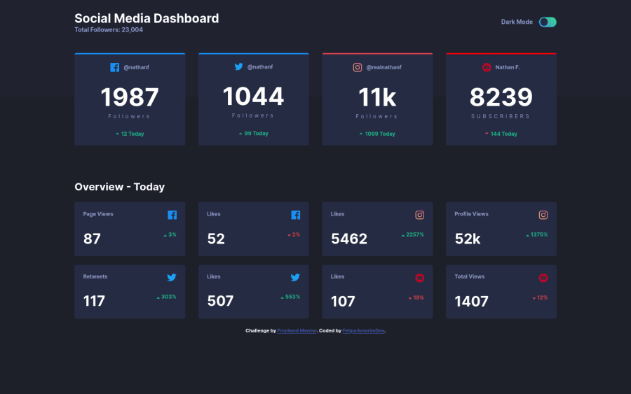
Responsive Dashboard with dark theme toogle using PURE JS and CSS
@FelipeCastroDEV
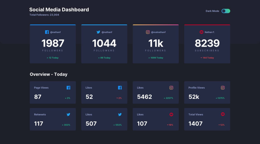
Design comparison
SolutionDesign
Solution retrospective
Hello guys,
I hope that you like my solution by the way, what is your opinion about the responsivity ?
And about the method that I used to apply the dark mode toggle, can you see any bug ?
I am open to suggestions, if you have anyone please make one commentary!
Community feedback
- @Yemisrach15Posted over 2 years ago
Hi Felipe, responsiveness is well done. Few things I suggest you do,
- You should include the overview section inside
main - Change the text dark mode to light mode or vice versa when checkbox is toggled.
- Input elements should have an associated label with discernible text for visually impaired users. Have a sr-only (screen reader only) text hidden from view but available to screen readers. The text could be something like Toggle mode.
- The social media icons here have meanings and are not only for decoration so, they should have non-empty
altattributes that describe them.
Congrats! No bugs in the method for dark mode toggle.
Marked as helpful0 - You should include the overview section inside
Please log in to post a comment
Log in with GitHubJoin our Discord community
Join thousands of Frontend Mentor community members taking the challenges, sharing resources, helping each other, and chatting about all things front-end!
Join our Discord
