Design comparison
Solution retrospective
I decided to change things up in a few different ways for this project.
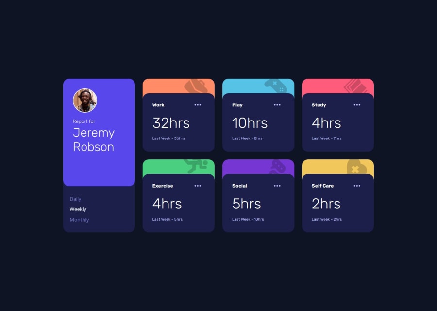
The first thing I did differently was that I did not use the images completely as they were. I noticed that the images given all had preset colors, based on the background color of its category. I didn't think this was very flexible if the user wanted a new background color or a different image, so I configured images to use a combination of CSS filters so that they instead dark the area of the background they are on. This allows them to be a tint of the background, like their original color, while allowing it to be flexible enough to use any image on any background while keeping it looking good.
The second thing I did was add more properties to the JSON data. This was mostly so that I could utilize this information for how I setup my JavaScript.
For my JavaScript, I wanted to create a system that was expandable. I also tried to keep my code concise by splitting it into 5 main files:
fetchData.jsis just to get data from my .json filecategoryCard.jsis a class that helps me model my categoryCard objectscategoryCardsManager.jsreads the data fromfetchData.jsand instantiates a thecategoryCards, and puts them into an object that is exportedelementMaker.jsis just used to create an HTML element to append to the main document, however it is used as a property for eachcategoryCardmain.jsis where I setup the buttons and begin appending the card elements to the main page
I think the way this is setup is nice, because each categoryCard contains the information for its own element, which is appended to the main page. This makes it easy to change the info on everything at once, as my function for updating info is based on the categoryCard class, which also has its own info from the JSON file it was made from.
This means that in my main file, I can just loop over my primary list of time cards, and call their functions to update. This was easy to do as there are only 3 buttons (daily, weekly, monthly) which just changes the hours and labels to match the information already given in the JSON file.
The design works well too. Since I am using grid, having more than 6 items actually doesn't look too bad, as they simply wrap down to the next row, leaving everything else perfectly fine. Mobile works fine too as it just makes the column longer.
Community feedback
- @yahappylemonPosted 7 months ago
Your work is impressive, it's flexible and expandable. Also, I like the way you manage your js code by using the concept of components.
Maybe you could add a loading message to inform the user in advance, since it will take some time for the browser to fetch data and render the DOM!
0 - @temesgen-982Posted 7 months ago
I didn't knew you were supposed to make the actual card elements using Javascript. I had them already on my HTML and I only uploaded the values. Anyways I think you made a good solution.
[Edited]
I was having a look at your code and I downloaded the
.zipfile from the repository and when I run it on vs code live server it doesn't work and it only shows the<header>0P@astnioPosted 7 months ago@temesgen-982 you need to change the import in the fetch script. I have one commented out for local development and one for the live deployment.
1
Please log in to post a comment
Log in with GitHubJoin our Discord community
Join thousands of Frontend Mentor community members taking the challenges, sharing resources, helping each other, and chatting about all things front-end!
Join our Discord
