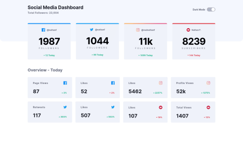
Responsive dashboard using pure css and vanilla javascript
Design comparison
Community feedback
- @DrKlonkPosted over 3 years ago
Hi Vitor,
I like it! There are some minor things to improve, but overall it works nicely.
I somehow didn't even know that creating the
<input>
inside of the<label>
element was a thing. Mozilla shows it as an alternative, so it seems like a completely valid option. I asked a question in Slack#best-practices as to what is the preferred method.You can also toggle a class on an element in javascript with element.classList.toggle('.className'). I think that would lead to some cleaner code in your solution.
However, I think I prefer to handle the dark theme switch method described here. That saves adding classes to all items and writing those classes separately in the CSS.
In the smaller cards all the arrows are green and point upwards. Easy fix!
All in all, a great job!
Cheers, Joran
0@Vitor-Silva27Posted over 3 years agothank you very much for your feedback, i've never worked with css variables before, but looks very interesting, i'll certainly use in my future projects, about the toggle method it's a really better option and i've already changed that in my code, and thanks for let me know about the arrows, i didn't notice it.
1 - @SrCienpiesPosted over 3 years ago
Amazing job! I love it. Just a detail about the Dark mode change, i feel is kind of abrupt change, maybe with a slower transition could be more pleasant.
0@Vitor-Silva27Posted over 3 years agoThank you for your feedback, i'm glad you liked it, i totally agree about the transition, i've already changed that.
0
Please log in to post a comment
Log in with GitHubJoin our Discord community
Join thousands of Frontend Mentor community members taking the challenges, sharing resources, helping each other, and chatting about all things front-end!
Join our Discord