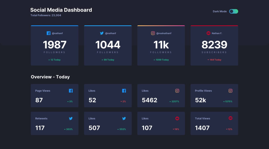
Responsive Dashboard - Using Grid and Flex in Sass
Design comparison
Solution retrospective
Hi Everyone, This challenge was a bit tricky and hard cause I'm still a newbie and have to learn the short way to use Sass as much as I can. And I know it's not perfect but I just have to upload it.
I have updated the solution and anyone had a question I will try my best. Happy Coding :)
Rahim
Community feedback
- @ApplePieGiraffePosted over 3 years ago
Hey there, Rahimullah Sharifi! 👋
I just came here to check out your work and noticed you hadn't received any feedback on this solution yet! 😀 But you've done a rather nice job! 👏 Like I mentioned, the layout of the cards is looking good! 👍
One or two small things I'd like to suggest are,
- Adding a little bit of space between the card/row of cards and the bottom of the page using margin/padding.
- Adding
cursor: pointerto the cards (as in the original design).
Keep coding (and happy coding, too)! 😁
0@Octagon-KingPosted over 3 years ago@ApplePieGiraffe Thanks man I will add these and update my solution too. Thanks for pointing it out.
0
Please log in to post a comment
Log in with GitHubJoin our Discord community
Join thousands of Frontend Mentor community members taking the challenges, sharing resources, helping each other, and chatting about all things front-end!
Join our Discord
