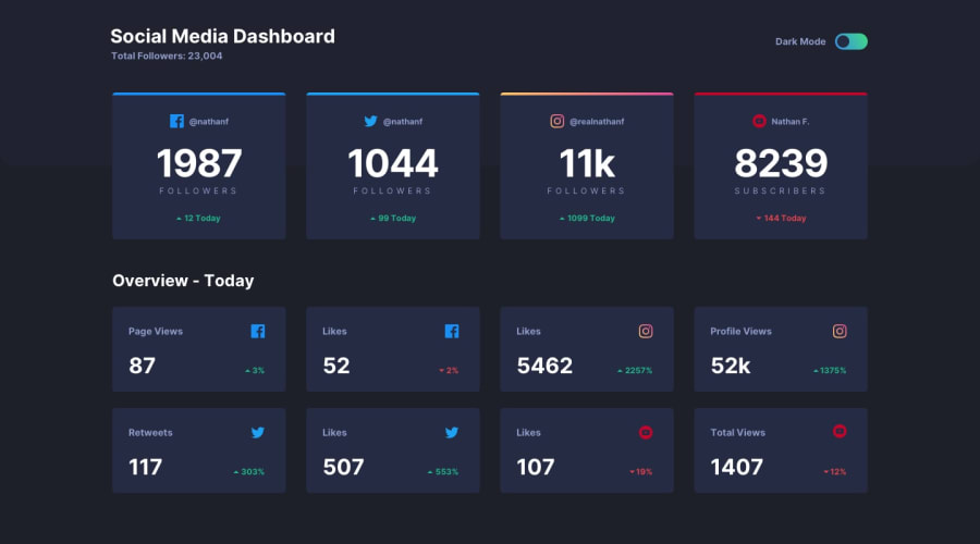
Design comparison
Community feedback
- @dlxzeus777Posted about 2 years ago
Hey Treasure, Nice solution however I have some tips for you!
Instead of
grid-template-columns: repeat(5,1fr)in your social-media-1 class change the number 5 to 4 because its a 4 column grid. The parent div with a social-media class should havedisplay:grid; justify-items: center;so it gets centered.In your div with a class of social-media-dashboard-2 you should delete every children's
grid-columnand add thisdisplay: grid; grid-template-columns: repeat(4,1fr); grid-template-rows: repeat(2,1fr);, so if you want to make it responsive all you have to do is change thegrid-template-columnsor thegrid-template-rows.0
Please log in to post a comment
Log in with GitHubJoin our Discord community
Join thousands of Frontend Mentor community members taking the challenges, sharing resources, helping each other, and chatting about all things front-end!
Join our Discord
