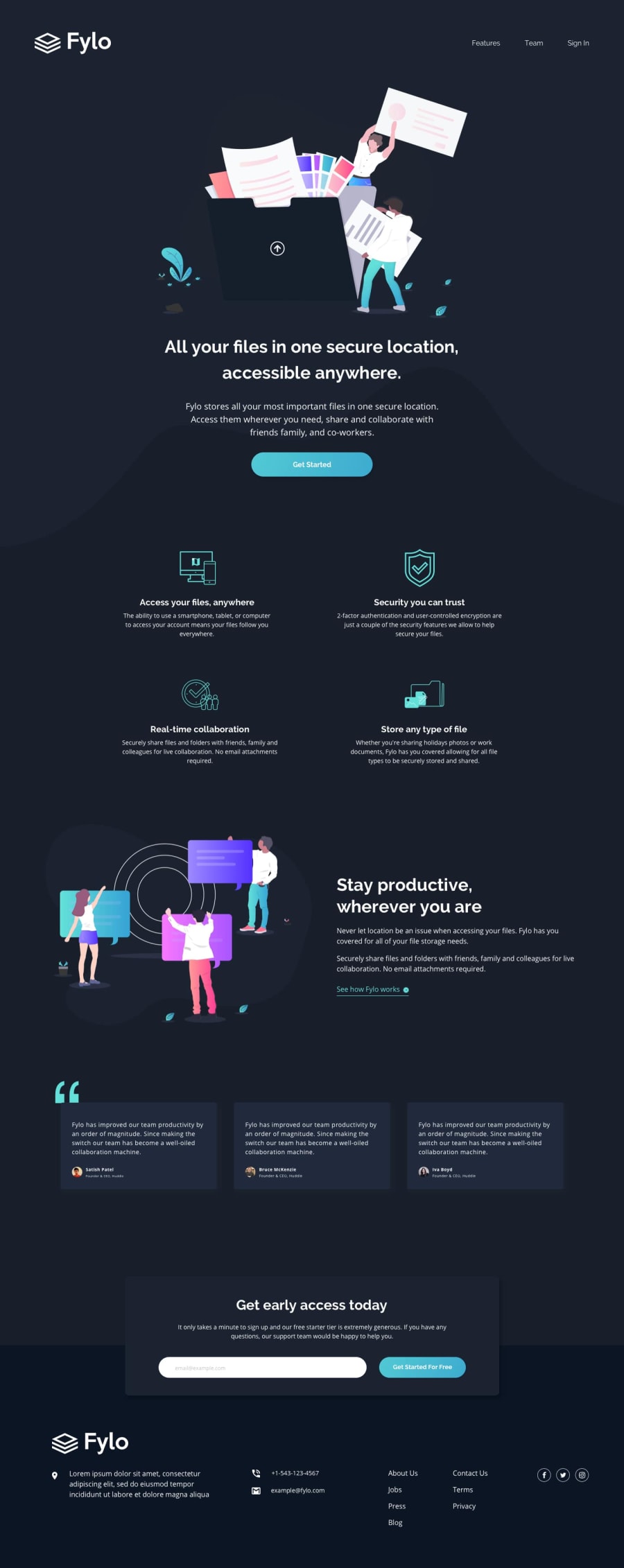
responsive dark theme landing page using Sass/SCSS
Design comparison
Solution retrospective
Feedback and criticisms are welcomed. Also, any pointers on background images; I don't think I quite nailed the curvy background image in the hero section. Thank you!
Community feedback
- @grace-snowPosted over 2 years ago
Hey, nice solution.
This is really good, but I think you need to work a little on consistency in the way you're using clamp to set widths, and work on html knowledge overall. For example, if you were to turn off all styles, would the html structure make sense on its own and be formatted how you would expect. That's a good way to check everything makes sense (i.e. would I expect a list there, would I expect that to be a button or a link, etc)
Here are notes I made in browser, I hope they are helpful
.hero__content.container {
  note: again, too large a minimum. This is wider than my phone screen;
}

.btn {
  note: why is this a button element?;
}

.features.grid {
  note: sections are unnecessary for each box in here. They act exactly like divs when unlabelled anyway;
  note: consider an sr-only heading of 'Features' followed by each feature having a h3;
}

.productive .content {
  /* margin-left: 1.5em; */
}

.productive .title {
  text-align: left;
}

.productive.flex {
  note: changes within this due to alignment issues on mobile;
}

.testimonials.flex {
  note: similar to previous - consider adding an sr-only h2 like 'testimonials;;
}

.testimonials .testimonial {
  note: consider using figure and figcaption. Blockquote can go inside the figure. Totally optionally idea;
}

.access .title {
  note: why is this a h3?;
}

.access form input[type="email"] {
  note: label should say what the field is, not be written as instructional text;
}

.access form .error {
  note: this should be in an element that has an aria-live attribute on it. That element must not be display none.;
  note: that error element wrapper will also need a unique id, and the input should have aria-describedby the ID;
}

.bg-footer {
  note: why is footer section a different width to content above on mobile? They should all be consistent;
}

footer nav > ul {
  note: Lists should definitely not be used for address email and telephone ! A list is not a list when it only has one item inside;
  note: only the links About us, jobs etc right through to privacy should be a list inside the nav. (one list not two) All of these should have anchor tags;
}

footer .social-list {
  note: Not part of the site nav so should not be in a nav element;
}

footer .social-list a {
  note: consider making these social links open in a new window. If you do that remember to include rel="noopener" as well for security reasons;
}

footer a {
  note: if a link, the Fylo logo link alt should say the link destination as well eg Fylo - Home;
}

footer nav {
  note: the first half of this is not nav content. Address telephone and email links do not belong in a nav. You could wrap the whole of the first half of the footer (including logo) in an address element if you wanted. That is intended to hold site author information.;
}
Marked as helpful1@rule-kellsPosted over 2 years ago@grace-snow thanks! Yes, I just started using clamp() and I need to brush up on the ch unit as well. I will try to be more consistent especially when it comes to buttons and links! Again, thanks for your help. I will apply this advice to my future projects.
0
Please log in to post a comment
Log in with GitHubJoin our Discord community
Join thousands of Frontend Mentor community members taking the challenges, sharing resources, helping each other, and chatting about all things front-end!
Join our Discord
