Design comparison
Community feedback
- @En-JenPosted over 4 years ago
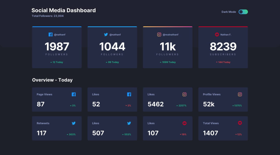
Hey Juan, nice job! Looks close to the design, it's responsive and the theme switcher works nicely 👏 I just have a few suggestions for you.
-
You're missing the hover states for the cards. The cards should change colors slightly and the cursor should be a pointer.
-
The Overview - Today heading should be a gray color in light mode
-
It would be nice to have the cards laid out in two columns for tablet screen widths. You can create two equal width columns like this:
grid-template-columns: repeat(2, 1fr); -
In your HTML you have
<p>F O L L O W E R S</p>. Instead of putting it in all caps and with spaces between the letters in the HTML, it's better practice to style it that way in CSS. -
You can keep all your CSS in one file with media queries for different screen widths instead of splitting them into separate files for desktop and mobile.
Happy coding!!
1 -
Please log in to post a comment
Log in with GitHubJoin our Discord community
Join thousands of Frontend Mentor community members taking the challenges, sharing resources, helping each other, and chatting about all things front-end!
Join our Discord
