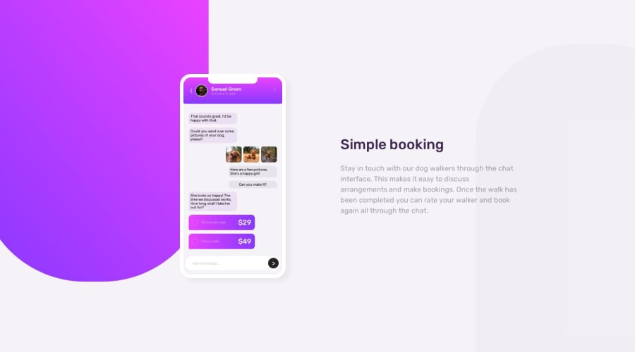


Design comparison

Solution retrospective
So this one was pretty difficult despite not needing JavaScript. The trial and error was immense and yet I still couldn't quite nail it completely. :') This truly was a test of my HTML & CSS skills and cannot wait to improve on them more. I am happy that I was able to add some responsiveness, however it was not like how I wanted. My question for you guy's is:
How can I get the gap issue between the phone and the paragraph to act properly?
Also, I am not sure about how I can gain access to the icons for the "type a message" box and for the phone. Was there an update to this website where nobody gets those icons added to the files they download? I tried using iconfinder and fontawesome, however I do not have a pro account and even when I tried downloading the small versions of the free ones, they came full sized. I know I can add them via HTML, but that becomes cumbersome and I like trying to keep my HTML as short as possible. You know, unless I get into a nesting frenzy like this project. :'D
I tried a lot of different things and I feel that the HTML nesting is pretty much entirely at fault in this project.
Thank you very much for taking the time to look through my project and I look forward to getting as much feedback as I can get. It truly is appreciated!!! <3
Community feedback
- @kabir-afkPosted about 1 year ago
Hey good job on completing the challenge , in terms of responsiveness, it is ok , but there are still some issues that I'd like to address . . .
Regarding Icons
As this was an intermediate challenge , which had to be done using only HTML and CSS, the icons had to made that way as well . . . 😅😅
Regarding paragraph and gap issue
I'm not exactly sure of the gap issue you are mentioning , if you'll elaborate then I might be able to help further, but I noticed that your
p-containerneeds aline-heightas well as , you need to increase it's width for a more accurate design . . good job otherwise!! 👍👍Marked as helpful1@lrobb95Posted about 1 year agoGreetings, @kabir-afk!
Thank you very much for those suggestions! I see what you’re talking about with the line spacing and I cannot believe I missed that detail! I am going to get on that right now.
The gap issue that I believe I am facing is regarding the spacing between the “phone” and the paragraph text. It seems to be way too spread out from each other on the desktop View in my opinion. As far as when comparing it to the design anyway.
0@kabir-afkPosted about 1 year ago@lrobb95 hey, I found what was causing the mishap . .
.content-container {
    display: grid;
    place-items: center; <---basically this right here
    grid-template-columns: 1fr 1fr;
    /* gap: 4rem; */
    width: 90%;
    height: 100%;
}
By using
gridandplace-items:center;, you were not able to override it with anything else . . . In order to avoid this issue , you can usejustify-selfandalign-selfin individual columns, rather than controlling all items positioning through the parent element . . . hope you find this to be helpful 🥂🥂Marked as helpful1@lrobb95Posted about 1 year ago@kabir-afk thank you very much for helping me on that, I’ll give it a go! :D
0

Please log in to post a comment
Log in with GitHub
Join our Discord community
Join thousands of Frontend Mentor community members taking the challenges, sharing resources, helping each other, and chatting about all things front-end!
Join our Discord