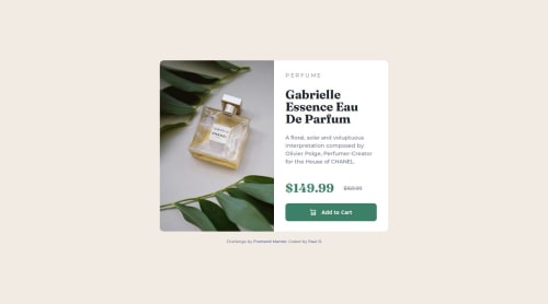
Submitted over 1 year agoA solution to the Product preview card component challenge
Responsive CSS with flexbox and accessibility design
accessibility

P
@ePaulo
Solution retrospective
What are you most proud of, and what would you do differently next time?
Learned how to use the tag to setup different images for different view-screen sizes. Coded the HTML based on the desktop design, then coded the CSS mobile before adding a media query to add code changes for the desktop layout.
What challenges did you encounter, and how did you overcome them?Had to learn how to use different images for different view-screen widths.
What specific areas of your project would you like help with?How (if possible) to force side-scrolling once the mobile view-screen width reaches the min-width setting... or is there no side-scroll bar displayed on mobile screens?
Code
Loading...
Please log in to post a comment
Log in with GitHubCommunity feedback
No feedback yet. Be the first to give feedback on Paul Olynek's solution.
Join our Discord community
Join thousands of Frontend Mentor community members taking the challenges, sharing resources, helping each other, and chatting about all things front-end!
Join our Discord