Design comparison
Solution retrospective
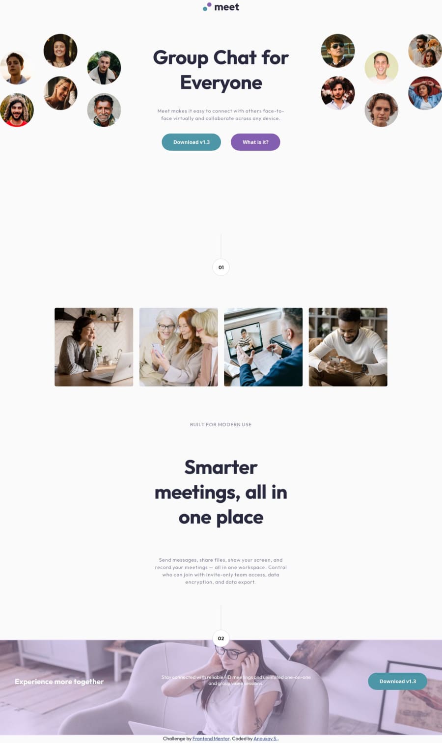
This project took a little while, I am proud of getting through the project. What I would do differently next time is to go back and add the styling for the background & correct the bottom footer image color. I am mostly proud of getting the screen sizes down for mobile > tablet > desktop sizes.
What challenges did you encounter, and how did you overcome them?I had issues with the sizing and overriding of styling within my media queries but eventually figured it out and learned as I go. I used various resources like MDN & web.dev articles to help me as well as referencing previous responsive projects for aid.
What specific areas of your project would you like help with?I need help with getting the background (with the faint stripes using CSS) using CSS to make it exactly like the final product and the exact color overlay for the bottom footer hero image. Everything else I believe I did alright by making it as close to the original product as possible. Any feedback is great. Kindly please advise. Thank you for taking the time to read my solution and help. Cheeers!
Community feedback
- @ephraimdjeketPosted about 2 months ago
Good job on completing this challenge! For the footer element, I struggled a bit aswell. I believe you can either use a pseudo-element on the container (::before) or create a div overlay element and position under.
Marked as helpful1P@xayrax88Posted about 2 months ago@ephraimdjeket I will have to play around with that later, thank you for the suggestion.
1
Please log in to post a comment
Log in with GitHubJoin our Discord community
Join thousands of Frontend Mentor community members taking the challenges, sharing resources, helping each other, and chatting about all things front-end!
Join our Discord
