Design comparison
Solution retrospective
pretty easy
What challenges did you encounter, and how did you overcome them?none
What specific areas of your project would you like help with?none
Community feedback
- @vtmsaenzPosted 3 months ago
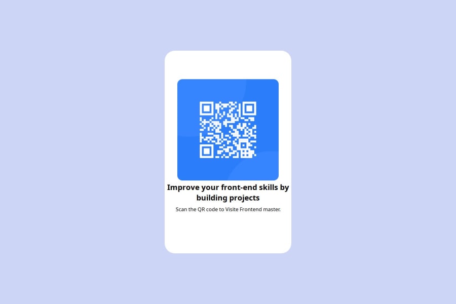
Create set up. You can add some padding to your text so the text isn't so close to the image! You can also remove the padding or at least lower it on the top to be able to make it more clean. Additionally, there is a lot of white space in the bottom. I see that you used the <span> tag. You can nest divs so you can isolate the text on it's on and add it's padding. Nest that within a div that sits in the container div to be able to adjust the overall padding and decrease the white space.
2
Please log in to post a comment
Log in with GitHubJoin our Discord community
Join thousands of Frontend Mentor community members taking the challenges, sharing resources, helping each other, and chatting about all things front-end!
Join our Discord
