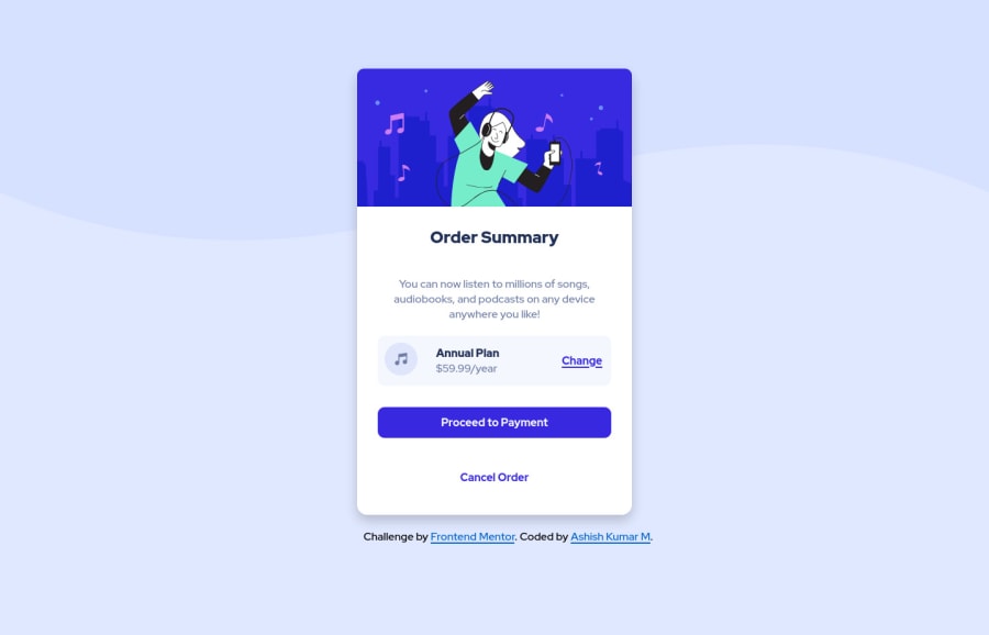
Design comparison
Solution retrospective
Is the structuring of the files is good enough?
What can I improve up on?
Community feedback
- @pikapikamartPosted about 3 years ago
Hey, awesome work on this one. Site in general looks great and it is responsive as well.
argel omnes already gave great feedback on this one, just going to add some suggestions as well:
- Don't use
height: 100%on thehtmlandbodyas they are relative to the viewport which caps their height. Use alwaysmin-height: 100vh. - On the
bodytag, your image-path on thebackgroundis wrong. Use this insteadurl("../images/pattern-background-desktop.svg") - Instead of using
role="main"on the.contentselector, just simply usemaintag instead ofdiv. - The illustration is on a decorative image. Decorative images should be hidden for screen-reader at all times by using
alt=""andaria-hidden="true"to theimgtag or onlyaria-hidden="true"if the image is usingsvg. - The music-icon as well is only decoration so hide it using method above.
annual plancould use a heading tag since it gives overview on what the section would contain. Anh2would be great.- Do not remove the
outlinestyling. If you did, always include a visual-indicator on the:focus-visiblefor those interactive elements like thebuttonatag and others.
Aside from those, great job again on this one.
Marked as helpful2@wickedWangoPosted about 3 years ago@pikamart Hey Raymart, Thanks for taking your time to review my code. These points are awesome.
I was not aware of the fact that we should hide the svgs for screen reader.
I forgot to update the changes in css image paths as I moved those files into a css folder moments ago.
I will keep these points in mind. Thanks for the detailed explanation about them.
As I am new to this CSS world, I am figuring out all the good design practices. I am feeling that I have learnt new things from your feedback.
Edit :- I have changed the code based on your feedback.
1 - Don't use
- @argelomnesPosted about 3 years ago
Hey Ashish,
Yes, your structuring of the files is good. One suggestion is to group stylesheets in one folder if you have 2 or more. I sometimes don't do this if one of my stylesheets is the source and the other is the output. In your case you referenced each in the HTML, so I highly recommend it.
HTML is also neat. Putting
icon-music.svginside a div is optional. A minor thing you may consider is puttingfooterat the bottom of your stylesheet. Just above the media query. So it follows the structure of your HTML as well. Reading it is easy this way.Overall, good job!
Marked as helpful1@wickedWangoPosted about 3 years ago@argelomnes Hey Argel, Thanks for taking your time and review my code. I am glad that you liked my code. I will try to incorporate those principles in my next projects.
0
Please log in to post a comment
Log in with GitHubJoin our Discord community
Join thousands of Frontend Mentor community members taking the challenges, sharing resources, helping each other, and chatting about all things front-end!
Join our Discord
