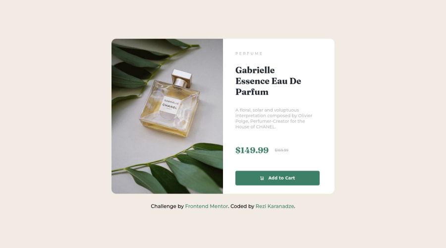
Responsive CSS grid and flexbox, using nested CSS.


Design comparison

Community feedback
- @visualdennissPosted over 1 year ago
Hey there,
congrats on completing the challenge successfully! Looks great.
I've noticed one issue when resizing: sometimes the image looks shorter than the right column of the card. This is because it looks like you have set a height: 500px on .img-div so while the right side stretches image stays at 500, causing some layout breaks. You can add height: 100% instead to fix that:
.img-div { height: 500px; border-radius: 15px 0 0 15px; height: 100%;
Hope this was helpful! Keep up the good work!
0@rezis-portfolioPosted over 1 year ago@visualdenniss Thanks for tip.
I just make it for mobile and desktop size but anyway it was useful thanks.
0 - @frank-itachiPosted over 1 year ago
Hello there 👋. You did a good job!
I have some suggestions about your code that might interest you.
HTML 📄:
- Wrap the page's whole main content in the
<main>tag. - If your code has different sections that have a specific purpose like a navigation, article, sections or footer, it’s a good practice to enclose those parts with HTML5 semantic tags. For example, you could use a
<footer>tag to wrap the<div class=”attribution”>section. - The heading order is important in the html structure so try to always start your headings and/or titles with an <h1> tag and then you can increase by one if you need to use more heading in your html code.
- Since the mobile design has a different image, you can use the
<picture>tag that allows you to interchange the images depending of the viewport size. Red more about this awesome tag here. - Make sure that the
<img>elements in your HTML code has an alternate (descriptive) short text. The reason for this is that screen readers can’t translate images into text. So to fix this you can do the following<img src=”…” alt=”short text” >
CSS 🎨:
- You can also use the
text-transform: uppercase;property to make the perfume word appear in upper case even though you typed it in lower case in the HTML file.
I hope you find it useful! 😄 Above all, the solution you submitted is great!
Happy
<coding />😎!0 - Wrap the page's whole main content in the


Please log in to post a comment
Log in with GitHub
Join our Discord community
Join thousands of Frontend Mentor community members taking the challenges, sharing resources, helping each other, and chatting about all things front-end!
Join our Discord