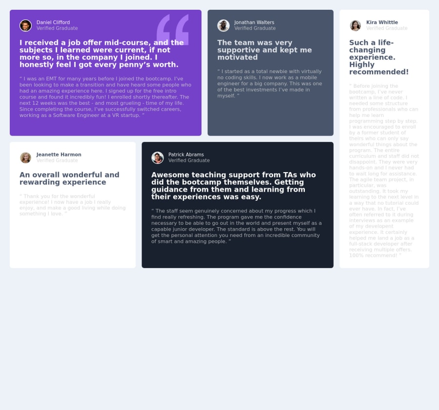
Design comparison
Solution retrospective
it was with a lot of struggle that I managed to do it this way, I will continue studying.
Community feedback
- @VCaramesPosted about 2 years ago
Hey @jorgealves-b, some suggestions to improve you code:
Regarding the comments about using an <h1> heading, since this a component and not a full page, the use of an <h1> heading would be incorrect for this challenge.
- To center you content to your page, add the following to your Body Element:
body { min-height: 100vh; display: grid; place-content: center; }-
The profile image needs an Alt Tag. It should state the following; “Headshot of -person’s full name-“
-
The only headings in this component are the names of each individual; “Daniel Clifford”, “Jonathan Walters”, “Jeanette Harmon”, “Patrick Abrams” and “Kira Whittle”
-
The Article Element would not work for this testimonials, since they cannot stand on their own instead you can wrap each individual testimonial component in a Figure Element, the individuals information should be wrapped in a Figcaption Element and lastly, the testimonial itself should be wrapped in a Blockquote Element.
Code:
<figure>
   <figcaption></figcaption>
   <blockquote></blockquote>
</figure>
More Info:
-
The
colorof the font for the white testimonials are the incorrect color. You will want to check the "study-guide" to see what the correct color should be. -
Add a third layout to make the transition from mobile 📱 -> desktop 🖥 views smoother.
Happy Coding! 👻🎃
Marked as helpful1 - @correlucasPosted about 2 years ago
👾Hello Jorge, congratulations on your new solution!
Great code and great solution! I did this challenge too and know how hard it is to set up this
grid layout. I think you've done a really good job building everything! Here are some tips for you:You’re in the right track I can see that you’ve used the majority semantic tags possible for this challenge, the only block you’ve missed is the paragraph containing the
quote textyou can improve the accessibility there using<blockquote>to indicate to screen readers that the content inside that paragraph is a quote.✌️ I hope this helps you and happy coding!
Marked as helpful0 - @AdrianoEscarabotePosted about 2 years ago
Hi Jorge pereira, how are you?
I really liked the result of your project, but I have some tips that I think you will enjoy:
- To improve the accessibility of the project you could have put an h1. Every page must contain a level 1 header, for people who use screen readers, identity what the main title is.
- To align some content in the center of the screen, always prefer to use
display: flex;it will make the layout more responsive!
Example:
body {
    margin: 0;
    padding: 0;
    display: flex;
    align-items: center;
    justify-content: center;
    min-height: 100vh;
}
The rest is great!
I hope it helps... 👍
1
Please log in to post a comment
Log in with GitHubJoin our Discord community
Join thousands of Frontend Mentor community members taking the challenges, sharing resources, helping each other, and chatting about all things front-end!
Join our Discord
