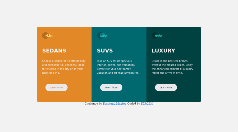
Design comparison
Solution retrospective
it was very easy the only defficult i had is finding the right number to size the div nicely.. i had fun with it and iam improving so much
Community feedback
- @vanzasetiaPosted over 2 years ago
Greetings, @f5rcbh! 👋
Good effort on this challenge! It's great that you leave the
alt
empty for those icons! 👍However, there are some areas that can be improved.
- When I see the site on
481px
and then start making the window larger up to1200px
, I notice two issues.- First, the cards don't have enough room at
481px
. So, adjust the breakpoint of the media query. - Second, the buttons start from almost a circle shape and then slowly become a pill shape. There's no need to set
width
andheight
on the button elements especially using percentage units. Somepadding
would be enough.
- First, the cards don't have enough room at
- The font family doesn't apply correctly. I'm not sure what caused it. However, try to import the correct font weight based on the
style-guide.md
. - The "Learn More" buttons should be link elements. As a user I would expect after I click it, it will navigate me to another webpage.
- On mobile landscape view, there are several issues.
- The attribution sits next to the cards. So, I recommend removing the
flex-wrap
property. - By setting
height: 100vh
on thebody
element. It makes it impossible for me to scroll to see content that gets cut off because there is no vertical scrollbar, in other words, thebody
element isn't growing to fit the content inside it. So, my recommendation is to usemin-height
instead.
- The attribution sits next to the cards. So, I recommend removing the
That's it! Hope you find this useful!
Marked as helpful1@f5rcbhPosted over 2 years ago@vanzasetia thanks for your feedback, I will put everything you said on my mind and try to be good 🖤
0 - When I see the site on
- @dostonnabotovPosted over 2 years ago
Hi, there. That looks great. But, I think you have to change the heading's font to 'Big shoulder' (if I am not mistaken). Also, reducing the width of cards can help to match the design even better. Good luck!
1
Please log in to post a comment
Log in with GitHubJoin our Discord community
Join thousands of Frontend Mentor community members taking the challenges, sharing resources, helping each other, and chatting about all things front-end!
Join our Discord