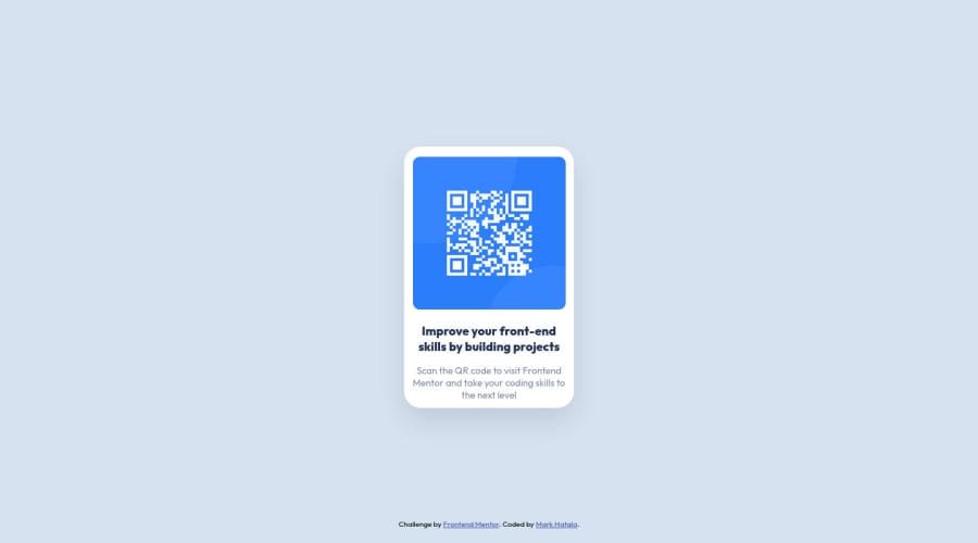
Design comparison
SolutionDesign
Solution retrospective
It was a nice introductory project. I'm looking forward to do the next tasks.
Community feedback
- @VCaramesPosted almost 2 years ago
Hey there! 👋 Welcome to FEM and congrats on completing your first challenge!🎊🍻
Here are some suggestions to help improve your code:
- FEM Best practice ✅, before moving on to the next challenge, always check your FEM report (It provides value information), to see what is incorrect and update your code with it so that you would not make the same mistake over again. This should be the first thing that should be done ⚠️ right after submitting the challenge.
- Every site should ALWAYS have ✅ a
mainelement not only for semantic purposes but also to help assistive technology find the main content of your content. For this challenge, it will serves as the component’s container ⚠️.
More Info: 📚
- The
alt tagdescription for the “QR image” needs to be improved upon ⚠️. Its needs to tell screen reader users what it is and where it will take them to when they scan it.
- Change ⚠️ the
heighttomin-heightin yourbodyelement, to improve your component's responsiveness.
- To properly center your content to the page, change
justify-content: space-around;tojustify-content: center;
- This two,
width: 100vw;andmargin: auto;, are not needed ❌ in thebody.
- Change ⚠️
widthtomax-widthin your component’s container to make it responsive. You will also want to remove theheightas it is unnecessary.
If you have any questions or need further clarification, feel free to reach out to me.
Happy Coding! 👾
Marked as helpful1
Please log in to post a comment
Log in with GitHubJoin our Discord community
Join thousands of Frontend Mentor community members taking the challenges, sharing resources, helping each other, and chatting about all things front-end!
Join our Discord
