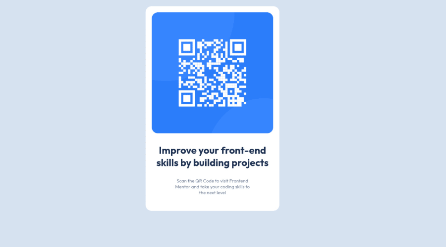
Design comparison
Solution retrospective
Please, I welcome every feedback or correction. Thank you!
Community feedback
- @12KentosPosted over 2 years ago
Hey @TobbyFranc,
Nice job on the project, it looks great! I looked through your css file and saw you selected some elements directly like so.
p{ color: var(--Gray-blue); font-weight: 400px; font-size: 15px; margin: 30px 0; }While in smaller projects like this one, it's ok it will cause you a lot of headaches on larger projects as this would select every p element on your page and give them those styles. I would suggest selecting everything with a class, or with a class and then the element directly.
Keep up the great work!
Marked as helpful0@TobbyFrancPosted over 2 years ago@12Kentos,
Thank you so much for the advice. I will continue with the practice you advised So I can get used to it. Again, I appreciate it.
0
Please log in to post a comment
Log in with GitHubJoin our Discord community
Join thousands of Frontend Mentor community members taking the challenges, sharing resources, helping each other, and chatting about all things front-end!
Join our Discord
