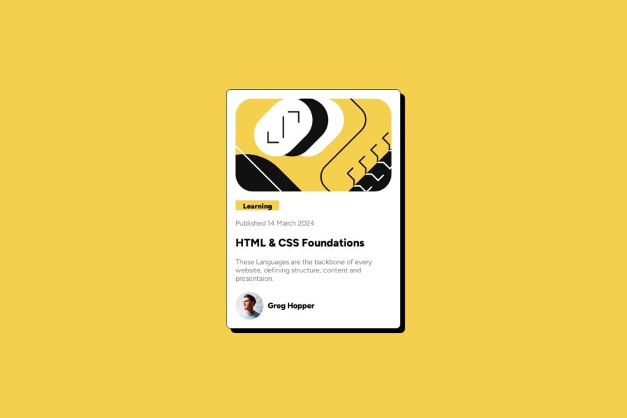
Responsive CSS Blog Card Design Using Flex Box Easy Solutioin
Design comparison
Community feedback
- @fake-alex-bluePosted 8 months ago
A nice solution here, it looks good, and your code is well structured and easy to read. I like that you used flexbox here, although you might want to look a little closer at your implementation, on my screen the large image appears centered but doesn't fill enough of the width.
I'd probably also have liked to see more semantic HTML used; but ultimately the challenge is to create a card component, outside the context of a larger site where it might be used; so I don't think that's too critical.
The main point I would mention is to do with the
border-radiusattributes on both the card itself and the yellow, card image. What you've gone for doesn't quite match the design file - and I'm not sure I prefer your version to what the design suggests.The card is probably looking for a
border-radius: 20pxand, from memory, the large title image is looking for aborder-radius: 10px- but I think you'll also need to create a more specific CSS selector so that you can target the larger title image without also catching the author photo.Marked as helpful0
Please log in to post a comment
Log in with GitHubJoin our Discord community
Join thousands of Frontend Mentor community members taking the challenges, sharing resources, helping each other, and chatting about all things front-end!
Join our Discord
