Not Found
Not Found
Not Found
Not Found
Not Found
Not Found
Not Found
Not Found
Not Found
Not Found
Not Found
Not Found
Not Found
Not Found
Not Found
Not Found
Not Found
Not Found
Not Found
Not Found

Submitted

Responsive, CSS animation, Render conditional images

@germanp007

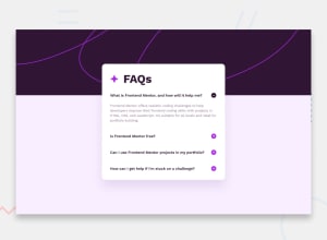
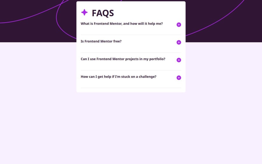
Desktop design screenshot for the FAQ accordion coding challenge

This is a solution for...

  • HTML
  • CSS
  • JS
1newbie
View challenge

Design comparison


SolutionDesign

Solution retrospective


Hi there

  • In this challenge, I combined useState and useEffect to dynamically render SVGs based on the screen width.
  • I added transitions for the accordion's expansion.
  • The entire styling was done using Tailwind CSS along with some parts in pure CSS.

Feel free to review the code and the project, and please provide feedback if you want (☞゚ヮ゚)☞(☞゚ヮ゚)☞(☞゚ヮ゚)☞

Community feedback

@petritnuredini

Posted

Congratulations on finishing your project! It's great to see your progress and commitment to building a functional and visually appealing application. Here are a few best practices and recommendations to enhance your work:

  1. Code Organization:

    • Component Structure: Good job breaking down the UI into reusable components. Consider further modularization for complex components for better maintainability.
    • Separation of Concerns: Keep styling, logic, and structure separate. Using CSS modules or styled-components can help achieve this.
  2. Performance:

    • Optimize Image Loading: If you're using images, consider lazy loading or using optimized formats like WebP for better performance.
    • UseEffect Dependency Array: Be cautious with your dependency arrays in useEffect. For instance, widthScreen in your resize effect might cause unnecessary rerenders.
  3. Responsive Design:

    • Media Queries: Good use of media queries for responsiveness. Test across different devices to ensure UI consistency.
    • SVG Responsiveness: Ensure that your SVGs are responsive and render well on all screen sizes.
  4. Accessibility:

    • Semantic HTML: Use semantic HTML tags where appropriate for better accessibility.
    • Keyboard Navigation: Ensure that all interactive elements are accessible through keyboard navigation.
  5. Styling:

    • Consistent Theming: Utilize CSS variables or a theme provider for consistent styling across your app.
    • Avoid Inline Styles: Inline styles can be hard to override and maintain. Consider using external stylesheets or styled components.
  6. Further Learning Resources:

Keep up the hard work and continue to challenge yourself with new projects! Each project is a stepping stone in your development journey. Stay curious and keep experimenting with new technologies and techniques. Looking forward to seeing your future projects!

Marked as helpful

1

@codster15

Posted

great ... now try to learn grid and flex to centre the content

1

Please log in to post a comment

Log in with GitHub
Discord logo

Join our Discord community

Join thousands of Frontend Mentor community members taking the challenges, sharing resources, helping each other, and chatting about all things front-end!

Join our Discord