

Design comparison

Solution retrospective
CSS Grid
What challenges did you encounter, and how did you overcome them?Responsive CSS >>>>Images. Is not fixed yet 😥
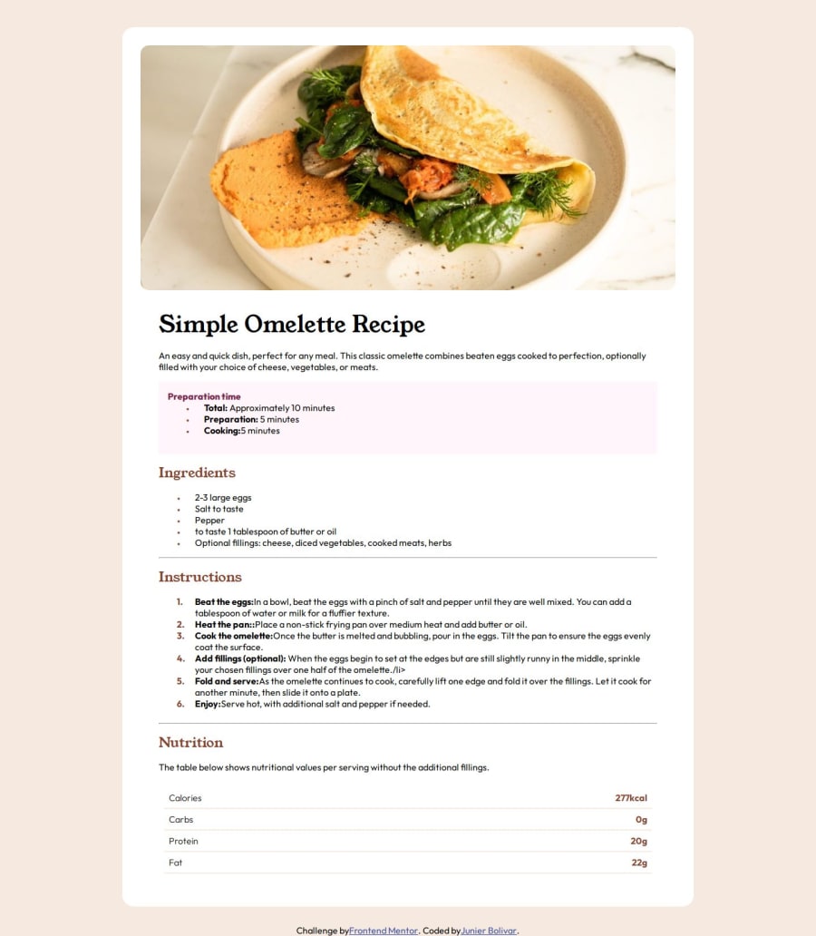
What specific areas of your project would you like help with?Responsive CSS >>>>Images : The image start enlarging but it zoom too much and its gone at certain formats. Responsive images is tough
Community feedback
- @JunbolPosted 12 months ago
I have always struggled with the media queries semantics. For example @media (min-width: 450px) {..... books and tutorials explain this using the word max : like :"Apply the following CSS rules to screens that are at max 450 pixels ." and my little artist neurons go nuts min, max 🤪. So here is simpler way to put it the comments: /*Apply these rules to screens that are at least 450 pixels wide or larger. */ and I always add it that to straight my cell back again. So dont mix min with max , max leave to use @media (max-width: 1080px) : /Apply these rules to screens that are 1080 pixels wide or smaller."/ Grid land Flexbox are a tough nut craker it seems daunting at first, but once you've got it, it's a game-changer for layout design. But familiarize with them a lot before use a framework like Tailwind (forget about Bootstrap and Foundation) or ChackaUI(React) so you can fly with them 🚀 For Flexbox declare you classes with display: flex to be able to enter your magic code and don't forget about playing around with Froggy and Zombies. Forget about all that nonsense with Grid just use fractions with display:grid and grid-template-columns: 250px repeat(1, 1fr); (for simple grids) and template grid-area combine with grid-template-area (for complex ones)
0 - @dkay9Posted 12 months ago
I really admire your ability to add comments to your code, they really helped me a lot to figure out how to do the nutrition table. Thanks a lot.
0@JunbolPosted 12 months ago@dkay9 Hi David Thank you for your comments. What you admire on my coding style some other hated it or laughed about it 😒. My advice: Use as much of comments as you need to after a few months or even days you don't have to figure out how that shit works :). And when you get to Javascript oh my goodness its like a jungle 🦚 in the night with 🐞s every where but the /comments/ are your 🔦 and your Rambo 🔪 to get out alive!!!!
0 - @JunbolPosted 12 months ago
Thanks Shivanshvohra,
.grid-container { display: grid; grid-template-columns: 250px repeat(1, 1fr); /* with fr you have more flexibility than just using auto Creates two columns / grid-gap: 0; / Remove gap to allow borders to connect */ padding: 10px; font-family: 'Outfit', sans-serif; }
0 - @ShivanshvohraPosted 12 months ago
way better than mine wouold love to know how you created that nutrition table
0


Please log in to post a comment
Log in with GitHub
Join our Discord community
Join thousands of Frontend Mentor community members taking the challenges, sharing resources, helping each other, and chatting about all things front-end!
Join our Discord