Design comparison
Solution retrospective
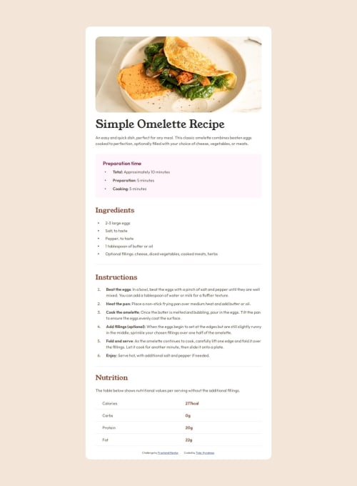
I am most proud of using pseudo elements to create the bullet points for the lists to have more control with the positioning.
I would do a better job next time of organizing my code by section as I got a little lost at times not having dedication flows for my sections of code.
What challenges did you encounter, and how did you overcome them?I faced a challenge of not resetting my margins and padding from the start. I forgot to do that, and after finishing the layout, i realized i needed to reset my margins and padding to be able to make my site behave how i wanted. I had to redo my layout after resetting which costed me some time.
What specific areas of your project would you like help with?I would like some insight now how to make lines of text that wrap on lists start at the same point rather than one line being indented and the other starting at the beginning. I had to use position absolute and pseudo elements to fix this as everything i found as a fix on the internet didn't work, i.e. (text-indent and padding that offset each other, etc.)
Community feedback
- @JomagenePosted 3 months ago
Great job on the project! I really appreciate the effort you've put into it. Your use of semantic HTML elements like
table
,tbody
,tr
, andth
is excellent, and I love how you're utilizing CSS variables—very clean and maintainable.I noticed that you're importing the Outfit and Young Sefir font families using the Google Fonts API, which is a solid approach. However, since it've been provided these fonts in the
assets/fonts
directory, it might be more efficient to use@font-face
for local font integration.One suggestion for improving the HTML structure is to consider replacing the
bodyContainer
with a<main>
tag, and you could swap out the<div class="headingPic">
for a<figure>
tag, which would enhance the semantics of your layout.Additionally, it would be beneficial to implement a CSS reset in your project. Different browsers apply their own default stylings, which can lead to inconsistencies. A CSS reset ensures a consistent look and feel across all browsers. You can refer to this CSS reset article for more details.
Keep up the great work, and let me know if these suggestions help!
Marked as helpful1@tylerhyndman484Posted 3 months agoThanks so much for all the helpful tips! I am thankful to report that with this being my first project I completed, I failed to do a lot of the things you mentioned, and now do all those things! Haha I appreciate the feedback and agree I need to use font face more as that’s one I am not as comfortable with. Great idea and will implement that in the future when I am giving fonts to locally host! @Jomagene
0
Please log in to post a comment
Log in with GitHubJoin our Discord community
Join thousands of Frontend Mentor community members taking the challenges, sharing resources, helping each other, and chatting about all things front-end!
Join our Discord