Design comparison
SolutionDesign
Community feedback
- @natashaplPosted about 2 years ago
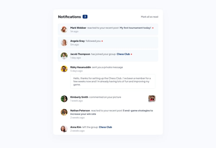
Hi Filipe. Nice work! I only noticed a couple of things. There are three notifications at the top, but after I mark all of them as read, there's still one at the bottom of the page that is marked as unread. As for accessibility, I suggest you add an h1 to your header and rerun the reports in the "View Reports" page to confirm all accessibility issues are resolved.
Hope this help. :)
0
Please log in to post a comment
Log in with GitHubJoin our Discord community
Join thousands of Frontend Mentor community members taking the challenges, sharing resources, helping each other, and chatting about all things front-end!
Join our Discord
