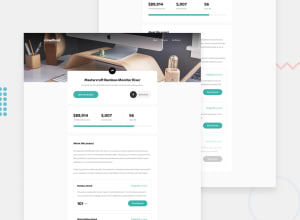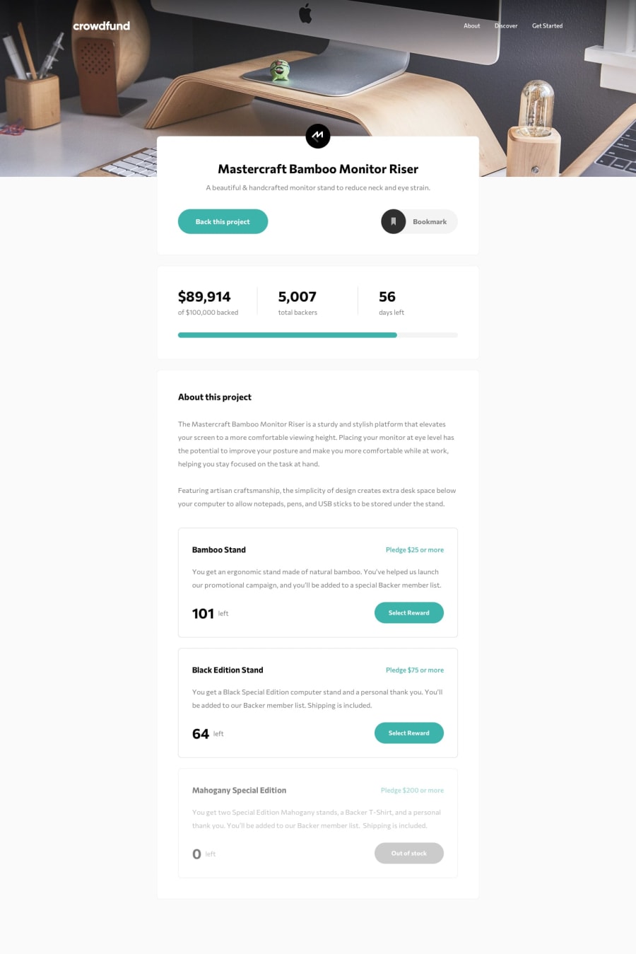
Design comparison
Solution retrospective
Hi everyone. I've done this challenge but in the I've had some questions in the process.
First: How to implement the "Cyan border" when you select the radio button using just CSS3. I've obtained that effect using some js code (I know is really ugly my js code, it needs to be refactorized, I just typing fast as possible to finish this challenge).
Second: how to improve the "disabled" effect. I did a filter and I get a really good result, but my button text isn't visible anymore.
Thanks in advance for all the feedback. :)
Community feedback
- Account deleted
I'm not sure how to answer you questions, but I found something that needs a little fixing, go into mobile view and click the hamburger than return to desktop view, you'll see what happens to the navigation links.
1
Please log in to post a comment
Log in with GitHubJoin our Discord community
Join thousands of Frontend Mentor community members taking the challenges, sharing resources, helping each other, and chatting about all things front-end!
Join our Discord
