Submitted 11 months ago
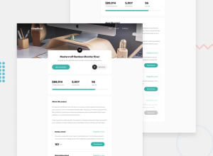
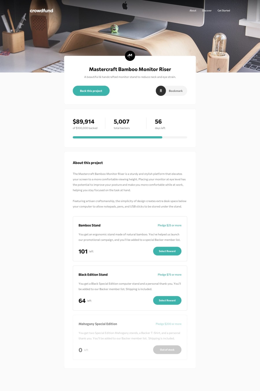
Responsive Crowdfunding product page
#react#typescript#vite
@CairoGarb
Design comparison
SolutionDesign
Solution retrospective
What challenges did you encounter, and how did you overcome them?
None was that challenging. The only mistake I did was to make the first section as absolute, and this made the responsiveness not that good (in my laptop, it shows correctly, in my computer that has a larger screen, it not).
What specific areas of your project would you like help with?None in particular. I know that the code is too extensive and I plan to narrow down and create more reusable code for now on. The CSS could be way less code, but that's it. Any feedback/tip will be appreciated!
Please log in to post a comment
Log in with GitHubCommunity feedback
No feedback yet. Be the first to give feedback on CairoGarb's solution.
Join our Discord community
Join thousands of Frontend Mentor community members taking the challenges, sharing resources, helping each other, and chatting about all things front-end!
Join our Discord
