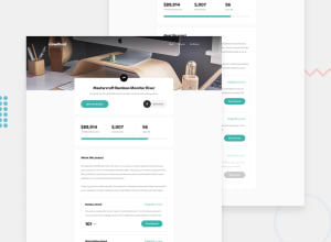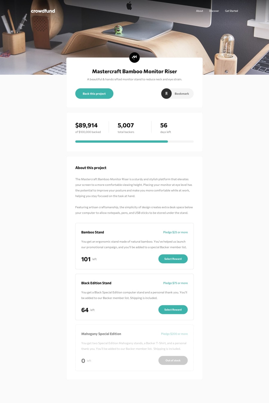
responsive crowdfunding platform with animated display numbers
Design comparison
Solution retrospective
I recently wrapped up the Frontend Mentor crowdfunding product page challenge and let me tell you, that was a doozy! 😅 I'm pretty stoked with how it turned out overall - I got all the major parts working like pledge selection, progress bar magic, and bookmark toggling. 🎉
But I gotta admit, I struggled a bit getting that backers counter to tick up properly when someone pledged. 😫 In my JavaScript I had the logic to increase the totalBackers number, but just couldn't get the DOM element to display the new count. Rookie mistake! 🤦♂️
Accessibility-wise, I know there's room for improvement. I need to rely less on visuals alone, add keyboard navigation, all that jazz. 🎵 I won't pretend to be an accessibility expert just yet, but it's definitely on my learning agenda!
My code organization is getting there I'd say. Baby steps! 👶 At least I had the sense to split my CSS into different files - modularization for the win!
Anyway, this was a super valuable challenge to build a responsive page with fun interactions. I learned a ton and feel way more prepared to level up my skills for the next project. Let me know if you have any other feedback on my code! I'm all ears! 👂👂👂
Community feedback
Please log in to post a comment
Log in with GitHubJoin our Discord community
Join thousands of Frontend Mentor community members taking the challenges, sharing resources, helping each other, and chatting about all things front-end!
Join our Discord
