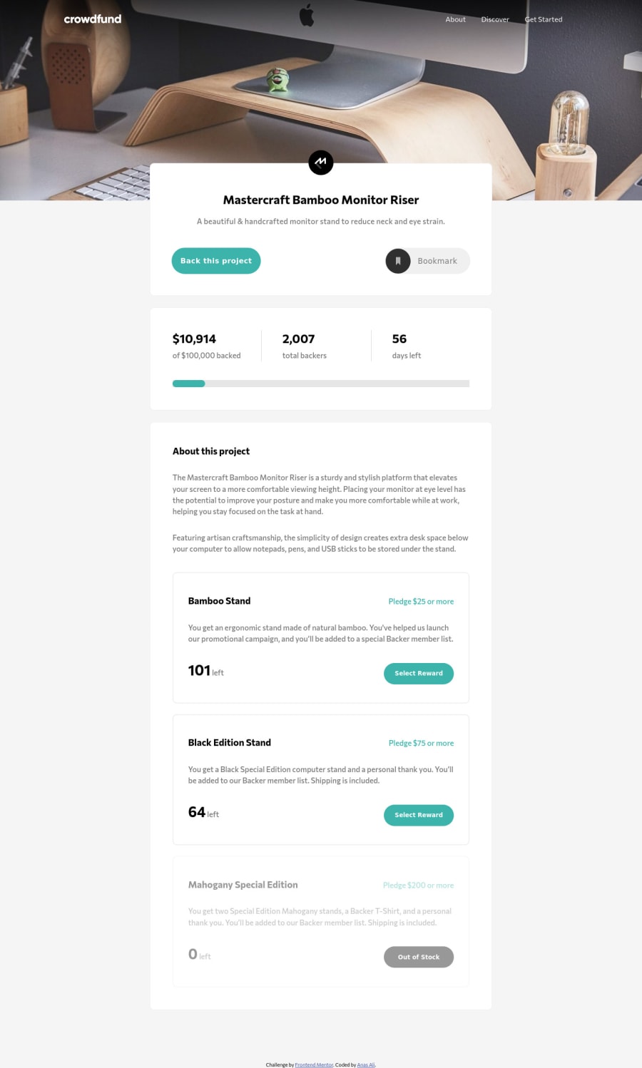
responsive crowdfunding page, using SCSS, flex, jquery
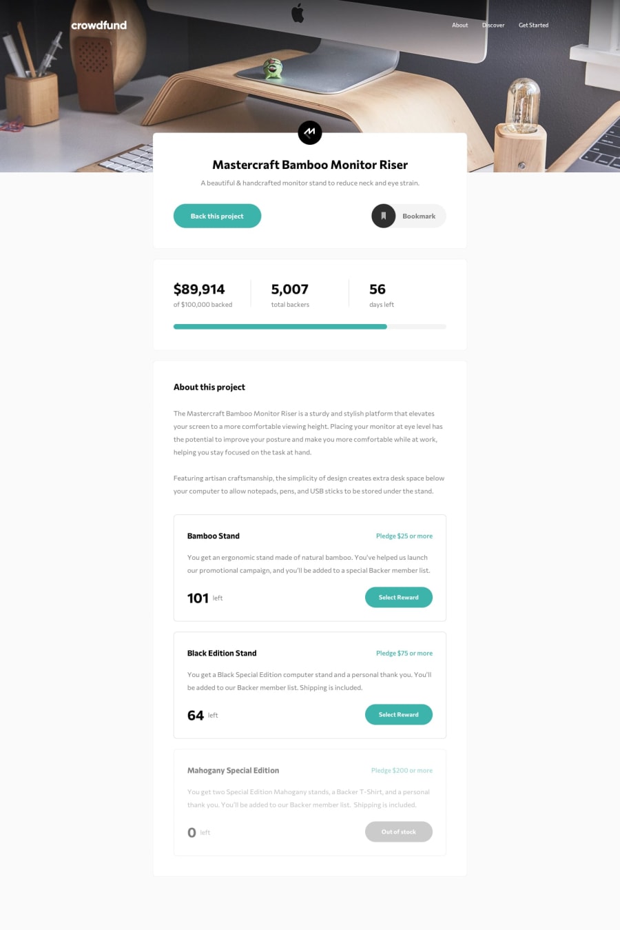
Design comparison
Solution retrospective
any feedback is appreciated, I struggled a bit on the radio buttons, still feel like they're finicky when resizing the window, if you know any solution on how to style them reliably that would be awesome.
Community feedback
- @aUnicornDevPosted over 3 years ago
Okay so I looked into the issue regarding the radio buttons, tweaked some properties and may have found a fix.
Use a border
.selectionContainer_background .selectionContainer .rewards .csections .radio__control {
    border: .125em solid #bdbdbd;
//other properties
}

.circule{
height:23px;
width:23px;
//other properties
}
This might center things exactly. Also, there can be an issue that will be resolved by removing the
transform: translateY(1px);Marked as helpful0@anas-cdPosted over 3 years ago@aUnicornDev thank you for checking it out, adding a border definitely helped ^_^
1
Please log in to post a comment
Log in with GitHubJoin our Discord community
Join thousands of Frontend Mentor community members taking the challenges, sharing resources, helping each other, and chatting about all things front-end!
Join our Discord
