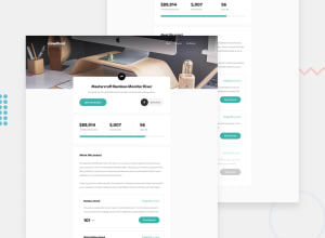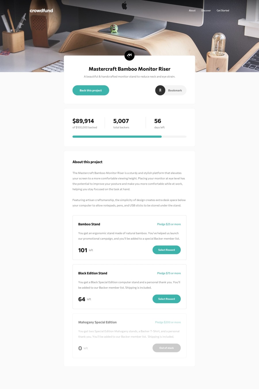
Design comparison
SolutionDesign
Solution retrospective
uh, this is my solution to the Crowdfunding page challenge. I had a little issue with the final 'Got it!' button and with styling the inputs. feel free to look through my code: constructive criticism and suggestions are welcomed. thank you! <3
Community feedback
Please log in to post a comment
Log in with GitHubJoin our Discord community
Join thousands of Frontend Mentor community members taking the challenges, sharing resources, helping each other, and chatting about all things front-end!
Join our Discord
