Submitted over 1 year ago
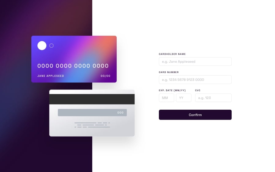
Responsive Credit Card Screen, Desktop Tablet Mobile
@codarose
Design comparison
SolutionDesign
Solution retrospective
Are there a set of standardized rules for form validation when it comes to common use-case input fields, like credit card validation?
Is there a better way to do the responsive set-up? This was my first time trying mobile-first design and I had a harder time minimizing my code footprint.
I was able to get the gradient background to have a curved border radius for the name input field, but for some reason with the same exact styling applied the border was not curved for any of the other focused input fields. Any insight into this issue is appreciated :)
Community feedback
Please log in to post a comment
Log in with GitHubJoin our Discord community
Join thousands of Frontend Mentor community members taking the challenges, sharing resources, helping each other, and chatting about all things front-end!
Join our Discord
