Design comparison
SolutionDesign
Solution retrospective
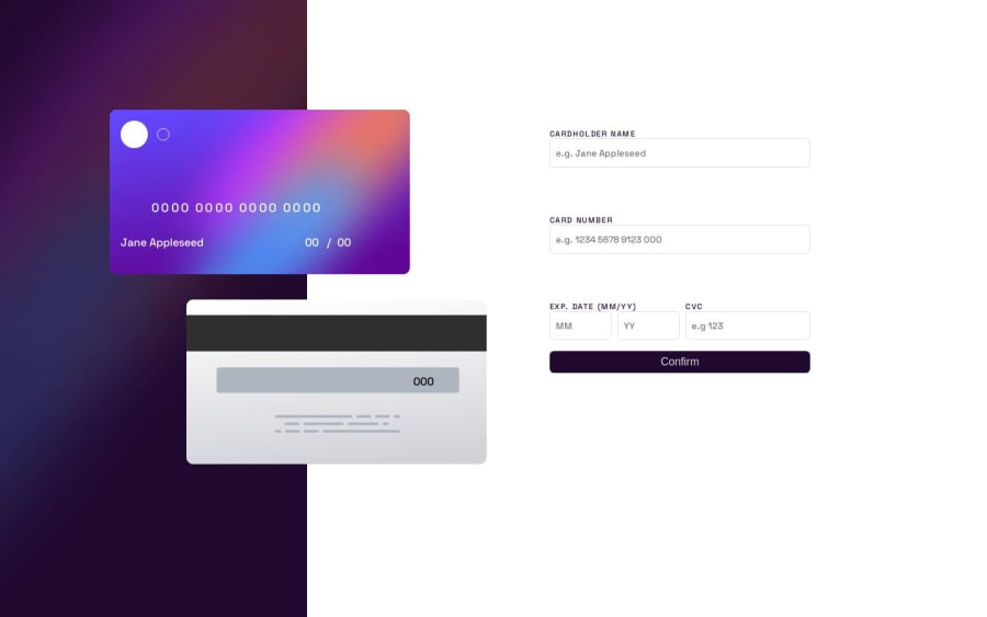
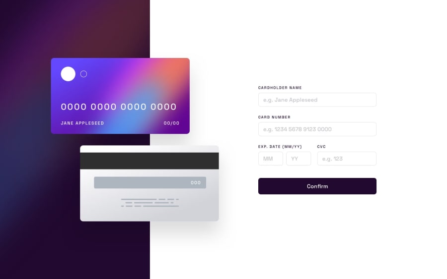
I had a lot of trouble positioning the cards and because of that the responsive part of the site is a little odd. At the beginning I used position: absolute to move the cards but it was really tricky to align the numbers inside when I change the window width, then I just used padding and margins to aling them.
Community feedback
Please log in to post a comment
Log in with GitHubJoin our Discord community
Join thousands of Frontend Mentor community members taking the challenges, sharing resources, helping each other, and chatting about all things front-end!
Join our Discord
