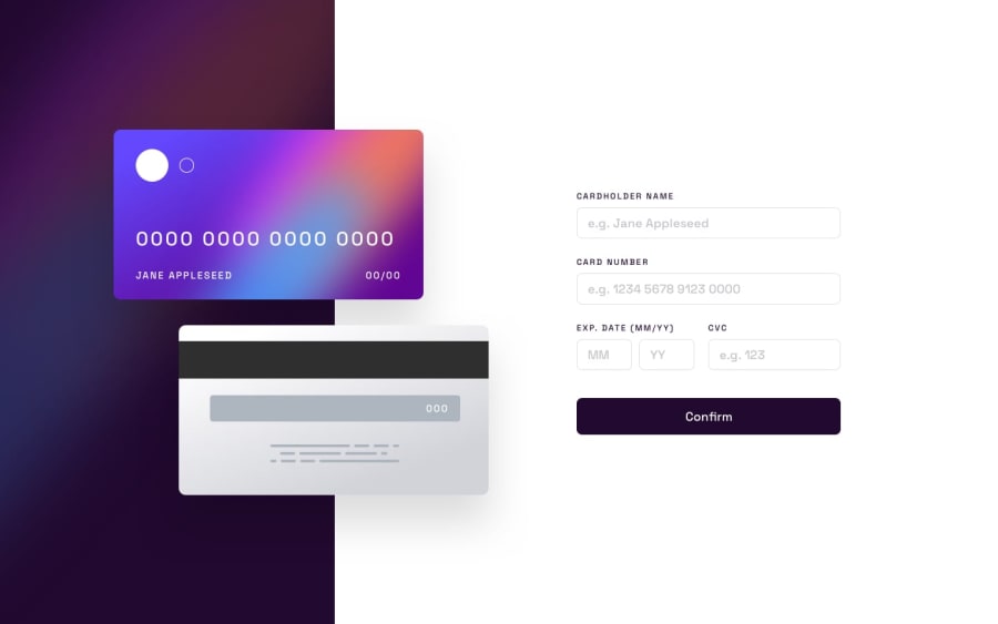
Responsive credit card detail page with interactivity features
Design comparison
Solution retrospective
I am proud to finish this project, it challenged me a lot and help me understand more features
What challenges did you encounter, and how did you overcome them?The challenges I encountered are mostly CSS styling , trying to place elements exactly as the design specifications was a challenge , I managed to solve it using online documentation and a lot of trail and error. And being able to display credit card information in the specified format was challenging , luckily I found a good stack overflow answer for this problem and managed to solve it
What specific areas of your project would you like help with?I would like to know a better CSS code for the card image elements than what I have used. If some can help in making it responsive without adding a lot of code that would be a real help
Community feedback
Please log in to post a comment
Log in with GitHubJoin our Discord community
Join thousands of Frontend Mentor community members taking the challenges, sharing resources, helping each other, and chatting about all things front-end!
Join our Discord
