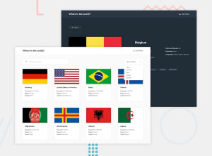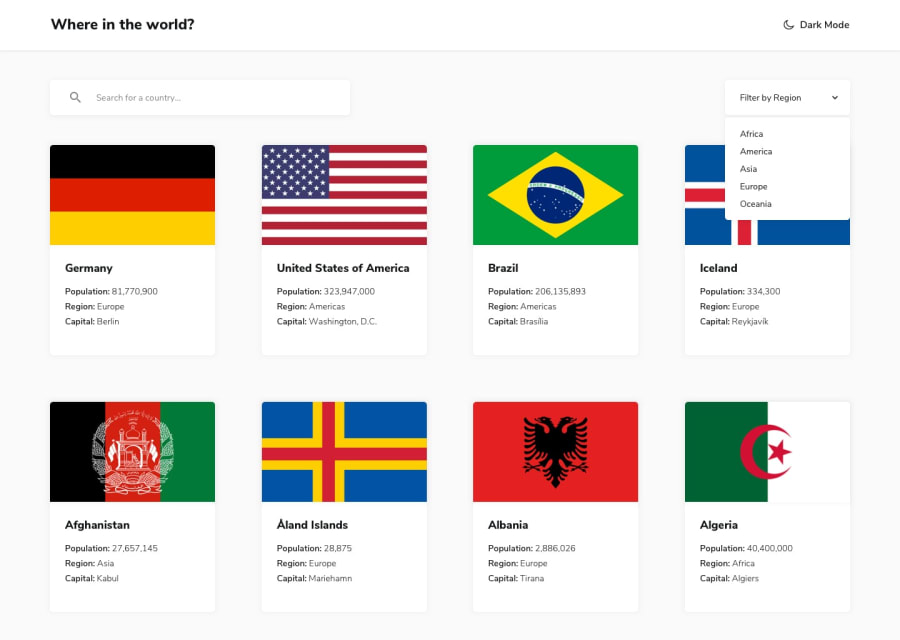
Responsive country-render page, HTML5, CSS3, Vanilla JS.
Design comparison
Solution retrospective
This project was a true challenge for my current knowledge, focusing on the characteristic that every time you click on a neighboring country, that country will be rendered and so on with the others, it was the part that was most difficult for me but I am very happy of having been able to carry it out and finish this project.
I have used Vanilla JS trying to be more familiar with the basics of JS, without resorting to a framework, I have also decided to alter the style of the challenge a bit and give it a different style, such as when clicking on one of the countries instead of being rendered on the same homepage, the page opens a modal window that provides us with more detailed information than what we have on the homepage.
If you all have any suggestion. Please let me a message. Thanks a lot
Community feedback
- @CallMe-ALPosted over 2 years ago
I like your different takes on the site style-wise! The modal especially is a nice touch. I like the image showing no country has been found and emojis next to certain info, too. Some suggestions:
-Adding a transition when toggling between light/dark modes can help make the change feel more smooth. -I can search for white space in the search bar -- using the .trim() method on your search input can help prevent this issue. -Try adding some styling to let users know clicking on a border region will take them to that region. -Check over your report for some minor accessibility issues.
Overall great job, again love the changes. As an additional challenge maybe try displaying regions conditionally based on search input while the user types (hint: the .filter() method can be helpful here!). Keep it up, man!
Marked as helpful1@Omared250Posted over 2 years agoHi @CallMe-AL,
Thanks for the feedback I really appreciate it, I will work on improving the aspects of the project that you tell me, again thank you very much.
1 - @webguy83Posted over 2 years ago
There are a few issues here:
I tried filtering any country and it's broken and doesn't yield any results even if I type in a country correctly. When I am on the broken results screen and in dark mode it doesn't extend all the way to the bottom of my screen. When you are at the broken screen there is no way of getting back the countries unless you use the Regions dropdown and manually load in more
Header bar should extend the full width of the users screen accroding to the mockup. Font size is off on the header text Since you load your api call with all the countries at the beginning of the app there shouldn't be a need for further api calls when you filter the region (big performance implications) You have JavaScript errors in our console Look at Macau and you see it has a capital of undefined
These here are my opinions: Having a modal screen you have to be careful with them. They generally work with as little data as possible but if you look at the requirements for this project it has a lot more data to be shown which would be too much for the modal to handle and in this case it makes sense to have a details page. The buttons also in your modal for the Border Countries don't really look like buttons at all, just simple text.
Also look into the report with the accessbility and html issues too. Hope it helps!
0
Please log in to post a comment
Log in with GitHubJoin our Discord community
Join thousands of Frontend Mentor community members taking the challenges, sharing resources, helping each other, and chatting about all things front-end!
Join our Discord
