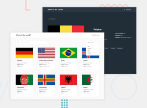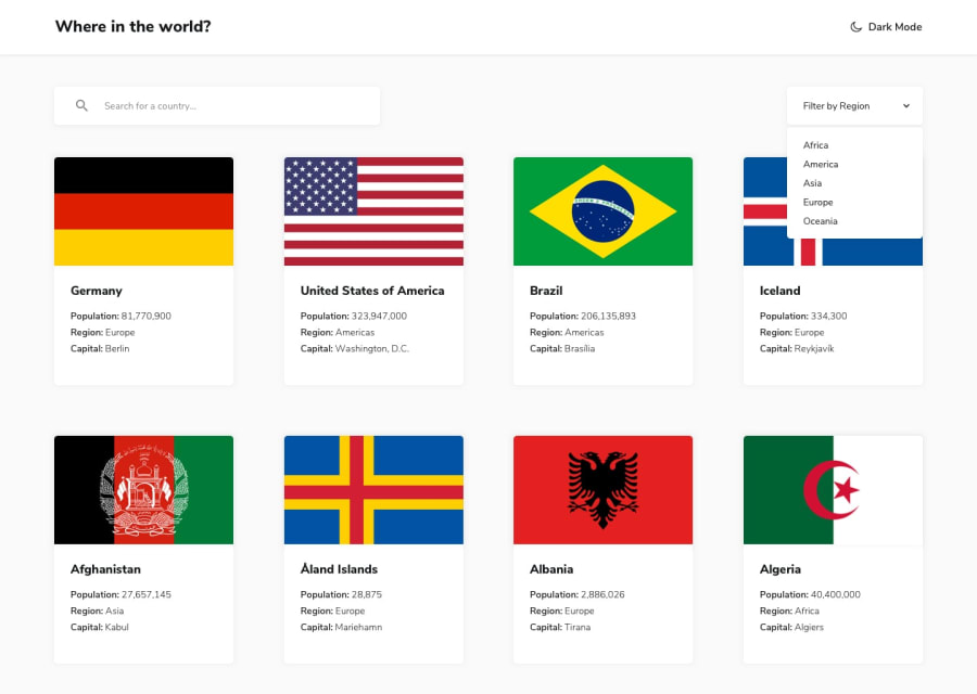
Design comparison
SolutionDesign
Solution retrospective
this challenge was very intensive I found many difficult bugs and I tried to solve them
Community feedback
- @mehmetakifakkusPosted over 1 year ago
Congratulations for completing this challenge!
Your solution has all the functionality with correct results. But I have some comments regarding to the challenge, especially for the visual part:
- Visually, it is better to imitate the same design as much as possible. You can compare the design and your solution in the DESIGN COMPARISON section of the this challenge's page.
- Hover effect when hover the card is nice, -I can also add this in my own project- But one note about card is that card height is not the same so they seem not good visually. That would be perfect of you make them the same height. In your
.country-cardcss class, you can addheight: 360pxas an attribute, then they will be the same height - For card layout you can use css grids, and you can specify number of grids according to the screen width. For instance, in your div contains your cards, for screen width greater then 768px, you can create 2 columns, then similarly, after 1024px you can have 3 grids:
@media (min-width: 768px)
.grid-container{
    grid-template-columns: repeat(2, minmax(0,1fr));
}
@media (min-width: 1024px)
.grid-container{
    grid-template-columns: repeat(3,minmax(0,1fr));
}
Thank you for your nice project and happy coding!
0
Please log in to post a comment
Log in with GitHubJoin our Discord community
Join thousands of Frontend Mentor community members taking the challenges, sharing resources, helping each other, and chatting about all things front-end!
Join our Discord
