
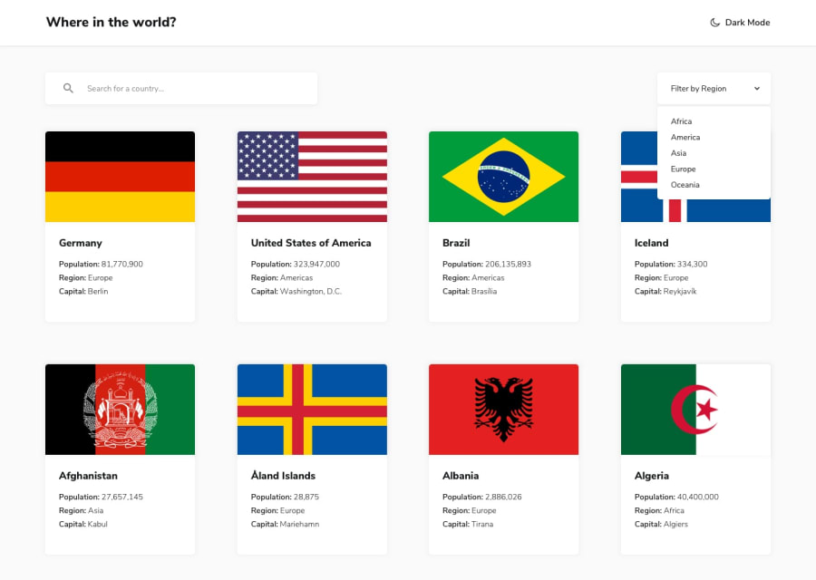
Responsive Countries Info website using React and Tailwind CSS

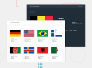
Design comparison
Solution retrospective
- What best practices should I follow?
- How I can Improve my design further?
Community feedback
- @remmjiPosted over 1 year ago
Hello there 👋
Those are few things you can improve 📈 :
🌱 Give "cursor: pointer" to all clickable elements, so users know they can interact with them.
🌱Ensure that all cards follow the same pattern.Its important for maintaining UI standards. Having the 'Details' button in a different location on each card not only looks inconsistent but also deviates from standard design practices.
🌱Your details page should be displayed in a layout that is consistent with the provided design. I recommend a grid layout for better visual organization and consistency.
🌱The language buttons on the page are confusing as they resemble buttons, but do not currently have any functionality. It would be better to distinguish them from actual buttons or provide them with a clear purpose.
I hope this advice will be helpful in improving your project! 🚀!
Marked as helpful0

Please log in to post a comment
Log in with GitHubJoin our Discord community
Join thousands of Frontend Mentor community members taking the challenges, sharing resources, helping each other, and chatting about all things front-end!
Join our Discord