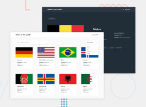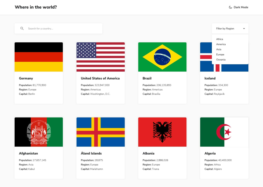
Responsive countries api web app with React JS
Design comparison
Community feedback
- @Mahmoud-ElagamyPosted 7 months ago
Thank you for your hard work on this project. I've been using your Rest Countries API app and wanted to share some suggestions for improvement.
1- Layout: Would be great if you set a max-width for the container to prevent it from becoming overly wide on larger screens, which can improve the overall layout and readability of the content.
2- User interface: Maybe changing the text color on dark theme would be great also.
By incorporating these changes, the app could become even more user-friendly and informative.
Good luck with the improvements!👍
Marked as helpful0
Please log in to post a comment
Log in with GitHubJoin our Discord community
Join thousands of Frontend Mentor community members taking the challenges, sharing resources, helping each other, and chatting about all things front-end!
Join our Discord
