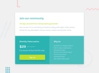
Design comparison
Solution retrospective
Hey guys. I'm stuck here trying to use flexbox to make this page responsive. I have tried using different flex properties including flex-grow/shrink/basis/wrap and media queries but I'm unable to stack the last box below when the screen gets smaller (ex: 678px) and I'm not sure what I'm doing wrong. I want to use only flexbox and not grid, float, etc. to complete this. I'm trying to completely understand how to use flexbox so any help is deeply appreciated.
Community feedback
- @claire-caPosted over 3 years ago
Your solution looks really good on desktop - well done! The one thing I would suggest here for your issue with the smaller screens is that you should really start off coding for smaller screens first and then use the media queries to change things as the screen size increases. This is called mobile first.
One benefit of this is that on mobiles/small screens you’ll mostly be leaving the html in its natural flow, like in this design the mobile layout stays in its natural flow and you’ll find that you won’t need to use flexbox for major layout shifts until the screen size gets bigger. Effectively with the way you have done it in your current solution, you’ll have to undo a lot of the places you have used flexbox to get the mobile layout working and you’ll end up with a lot more code than you really need.
I hope this makes sense? Working this way made a big difference to me once I started doing it. You’re doing really well with using flexbox in your desktop design though, well done!
2@KakamotobiPosted over 3 years ago@claire-ca
Thanks for your feedback!
It makes a lot of sense. I kept thinking I know I can make my codes more short and precise but I couldn't get my head around it. I realized my codes were intertwined and influenced by one another and I lost control over the changes I made while trying to get it to work.
Your explanation helps a lot! Thanks for letting me know.
0@KakamotobiPosted over 3 years ago@claire-ca
I've updated my codes and it's now responsive! Thanks so much!
But I'm now struggling with the .container and footer. I was able to center the .container in the middle of the screen, and the footer at the bottom by doing this:
body {display: flex; flex-direction: column; position: relative;}
footer {position: absolute; bottom: 0;}
But this doesn't seem to work now.. I think it has to do with the height/vertical of the body (.container and footer's parent) but I'm not sure how to approach it.
Do you have any ideas by any chance?
0@claire-caPosted over 3 years ago@Kakamotobi
So glad I could help! It makes a big difference working that way doesn't it?
I've had a look at your updated code and it's looking great! Well done!
I think I see what you mean about the footer. I think the reason it isn't working anymore is because at some point you've removed the position:relative from the body and that's why it was sitting where you wanted at one point, but isn't anymore.
The way I would do this is to remove the position: relative from the body (or don't put it back in) and also remove position: absolute; and bottom: 0 from the footer and then just give the footer a margin-top: 20px so that it sits just below your container.
Hope all this helps.
0@KakamotobiPosted over 3 years ago@claire-ca
Thank you! It really does. My codes are much more easy-flowing.
You've been very helpful and I really appreciate your time. :)
0@claire-caPosted over 3 years ago@Kakamotobi
You're very welcome. Was happy to have helped! :)
1
Please log in to post a comment
Log in with GitHubJoin our Discord community
Join thousands of Frontend Mentor community members taking the challenges, sharing resources, helping each other, and chatting about all things front-end!
Join our Discord

