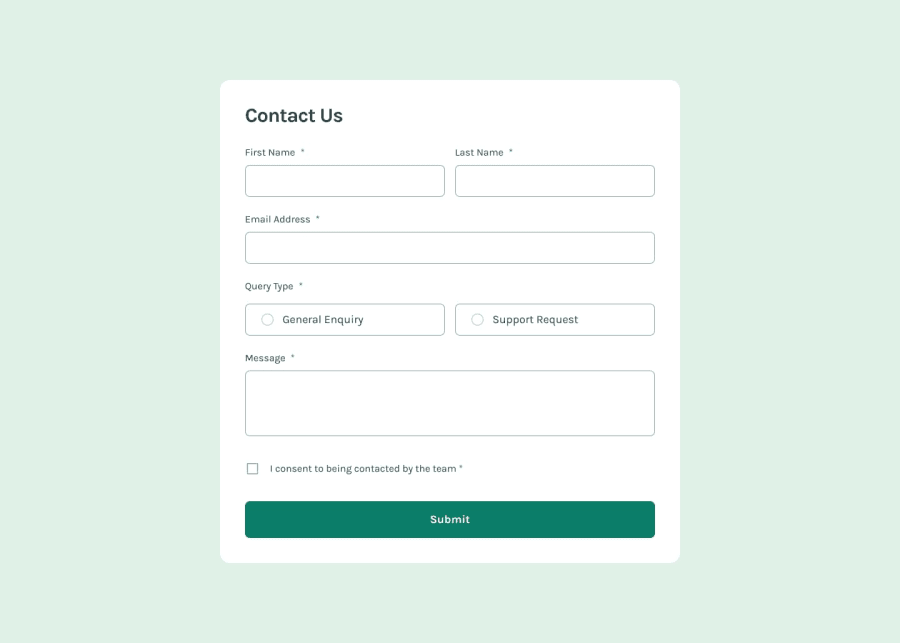
Design comparison
SolutionDesign
Solution retrospective
What are you most proud of, and what would you do differently next time?
- tailwind-css made more clear when styling.
- Using flex-box makes it easier to make the form responsive.
- Managing Form and toastify message from components made main component more clear.
- I will probably separate the form inputs to another file to manage professionally.
- Using react-hook-form to handle errors.
- It was hard to style toastify notification. It was hard to style toastify notification. I used the documentation and overwrite the existing css class.
- What are the alternatives to react-toastify?
- Are there other ways to validate?
Community feedback
Please log in to post a comment
Log in with GitHubJoin our Discord community
Join thousands of Frontend Mentor community members taking the challenges, sharing resources, helping each other, and chatting about all things front-end!
Join our Discord
