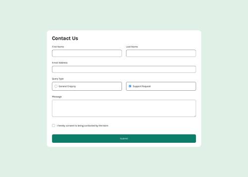
Submitted about 1 year agoA solution to the Contact form challenge
Responsive Contact Form
accessibility, jss, sass/scss
@antoniomontoia

Solution retrospective
What are you most proud of, and what would you do differently next time?
I'm proud that I was able to complete a form without any prior knowledge.
What challenges did you encounter, and how did you overcome them?A lot of them. When it came to writing the JavaScript part, I had to learn to get most things to work.
What specific areas of your project would you like help with?I'd like some feedback on my code, especially when it comes to understanding why the radio buttons and checkboxes are not accessible. I'd also appreciate some advice on how to change the radio buttons and checkboxes to the svg version, I could not wrap my head around that.
Code
Loading...
Please log in to post a comment
Log in with GitHubCommunity feedback
No feedback yet. Be the first to give feedback on Francisco's solution.
Join our Discord community
Join thousands of Frontend Mentor community members taking the challenges, sharing resources, helping each other, and chatting about all things front-end!
Join our Discord