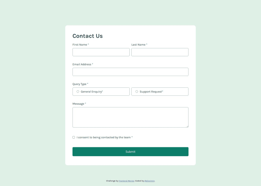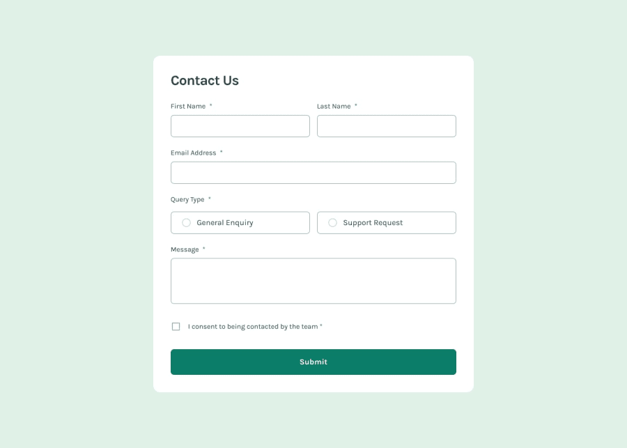
Design comparison
SolutionDesign
Solution retrospective
What are you most proud of, and what would you do differently next time?
I learnt how to use absolute positioning to display error messages. This ensures the messages appear clearly without impacting the margins of the input boxes.
What challenges did you encounter, and how did you overcome them?I had never used radio buttons before, so I took the initiative to research how to style them properly.
Join our Discord community
Join thousands of Frontend Mentor community members taking the challenges, sharing resources, helping each other, and chatting about all things front-end!
Join our Discord
