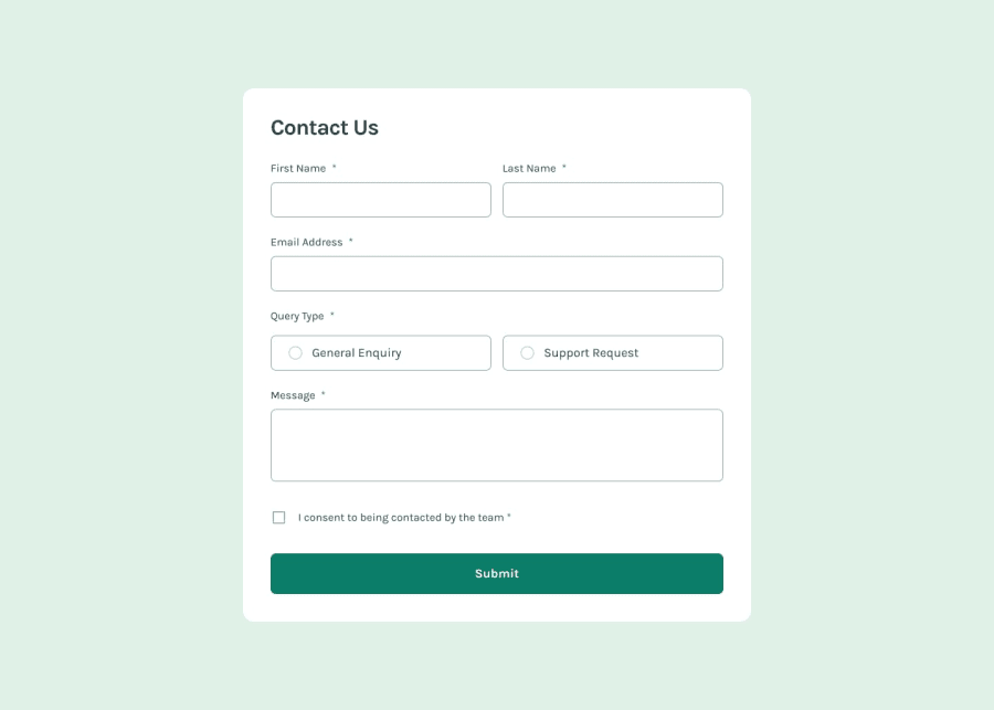
Responsive Contact Form with Custom JavaScript Validation
Design comparison
Solution retrospective
I’m most proud of successfully implementing the flex-grow property to achieve a flexible and responsive layout. It was satisfying to see the design adapt to different screen sizes. Additionally, I take great pride in having written all the form validations from scratch using only vanilla JavaScript, without relying on any frameworks or pre-written code. This hands-on approach gave me a deeper understanding of how validation works at a fundamental level.
If I were to do this project again, I would explore using a JavaScript framework or library to see how it might streamline the process and enhance scalability. While I’m proud of the manual approach I took, I recognize that leveraging a framework could save time and offer more built-in features, which could be beneficial for larger projects.
What challenges did you encounter, and how did you overcome them?One of the key challenges I faced was making the design responsive across different mobile screen heights. Ensuring that the layout adapted well, not just in terms of width but also height, required careful attention to media queries and flexible layout techniques. Additionally, implementing form validations in JavaScript, especially for email validation and looping through multiple input fields, was quite challenging.
To overcome these challenges, I turned to the community and official documentation for guidance. I researched best practices and sought advice from other developers who had faced similar issues. Through persistence and continuous effort, I was able to implement solutions that worked effectively. The experience not only improved my coding skills but also taught me the value of seeking help and learning from others.
Community feedback
- @TedJenklerPosted 3 months ago
Nice job with the validation! I especially like the custom validation you’ve added for the email—it's great to see you taking the time to implement regex validation, which not a lot of people do.
One suggestion: try adding a media query for the desktop size to make the layout wider on larger screens. This will enhance the user experience on desktops by making the content more spaced out and visually appealing.
Hope this helps!
Best, Teodor
Marked as helpful0
Please log in to post a comment
Log in with GitHubJoin our Discord community
Join thousands of Frontend Mentor community members taking the challenges, sharing resources, helping each other, and chatting about all things front-end!
Join our Discord
