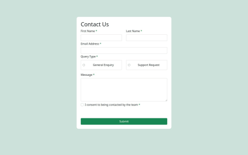
Responsive Contact Form with Bootstrap and JavaScript Validation

Solution retrospective
Implementing client-side validation added a layer of interactivity and user-friendliness to the form, ensuring that users receive instant feedback on their input
What challenges did you encounter, and how did you overcome them?During the development of my contact form project, I encountered several challenges related to fonts, colors, and overall design consistency
What specific areas of your project would you like help with?Is the JavaScript form validation logic efficient and effective in providing users with real-time feedback on input errors? Do the color scheme and font choices enhance the overall visual appeal and readability of the form? Are there alternative color combinations or font pairings that would better suit the design and branding aspects of the form?
Please log in to post a comment
Log in with GitHubCommunity feedback
No feedback yet. Be the first to give feedback on Richard Ngabo's solution.
Join our Discord community
Join thousands of Frontend Mentor community members taking the challenges, sharing resources, helping each other, and chatting about all things front-end!
Join our Discord