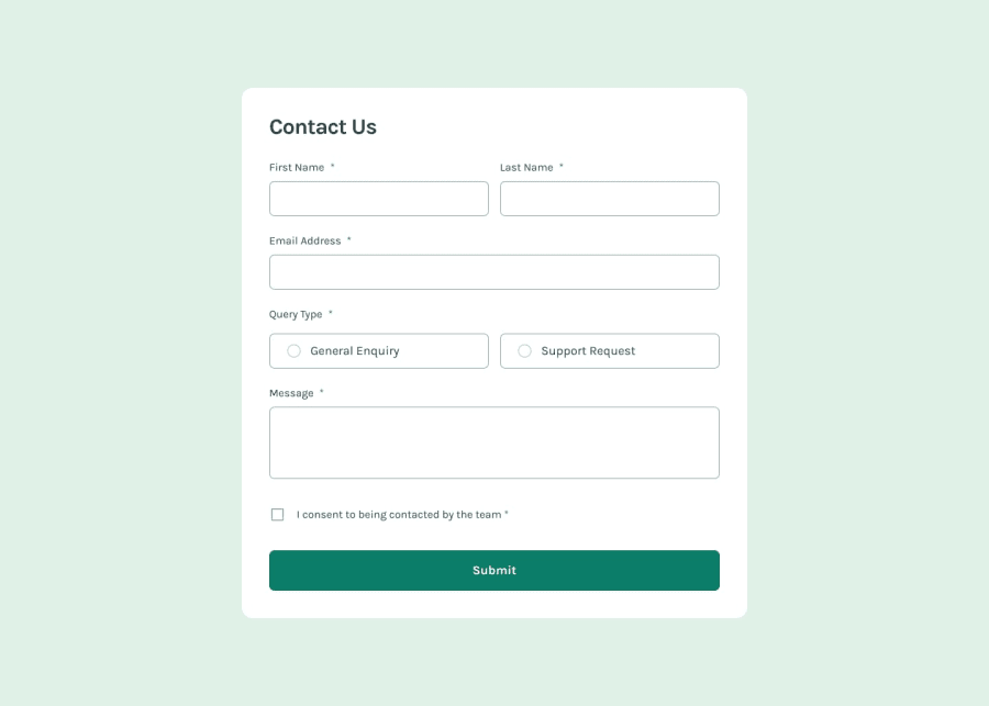
Responsive contact form using CSS display: flex and JS for logic.
Design comparison
Solution retrospective
I am mostly proud of learning some features of JavaScript, which I was rarely using while learning this language. Next time I would definitely take some time to clean up my code which is messed up after some experiments.
What challenges did you encounter, and how did you overcome them?The greatest challenge was to make this page responsive and to add the success message block. This block was so annoying to adjust because it was working poorly and I had to set it up in a specific way to make it look decent.
What specific areas of your project would you like help with?I would like to know when do I have to use grid instead of flex? I don't mean situations like a gallery or something, because there you (as I think) should use grid. But I would like to know from your experience what are the disadvantages of each of these displays?
Community feedback
Please log in to post a comment
Log in with GitHubJoin our Discord community
Join thousands of Frontend Mentor community members taking the challenges, sharing resources, helping each other, and chatting about all things front-end!
Join our Discord
