Responsive contact form using CSS and vanilla JS


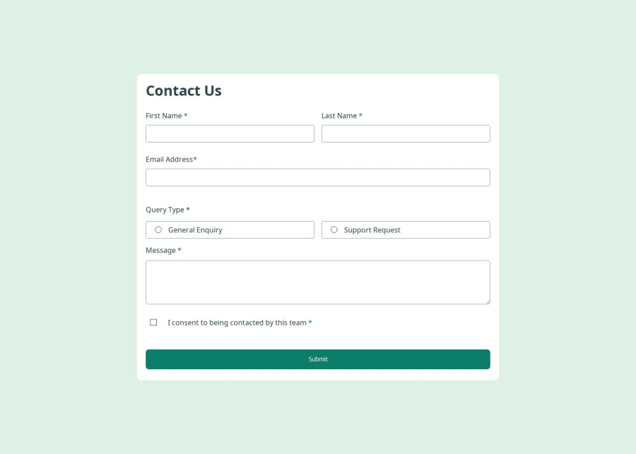
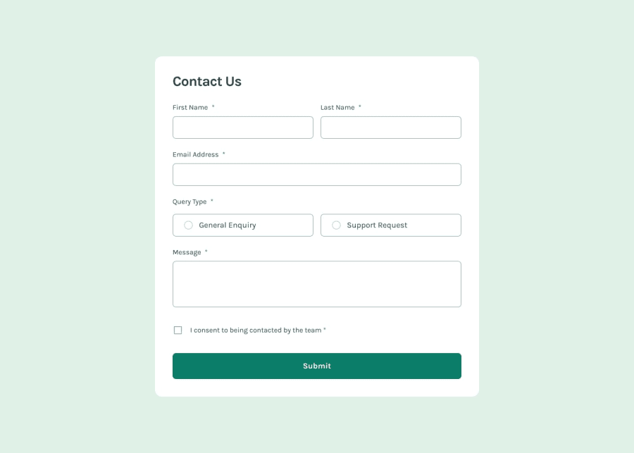
Design comparison
Solution retrospective
Completing the challenge and writing an improved HTML, thou it could be better.
What challenges did you encounter, and how did you overcome them?Multiple input validation and calling the function correctly
What specific areas of your project would you like help with?I just want someone to look at the HTML and JS, I'm open to learning about any improvement at all, I know this project could have been written better, especially the CSS
Community feedback
- @grace-snowPosted 3 months ago
I’m afraid there are accessibility problems in this that need fixing.
- Remove all fieldsets except for the one wrapping the radios. The message should not be in that fieldset either. It's really important to use fieldsets appropriately and not just add them everywhere.
- The autocomplete values on the first and last name fields arent correct. Look up the right values.
- You can use the required attribute on these fields instead of aria- required.
- Font-size mustn't be in px, especially not on the html or root. As soon as you change the root font size you've removed the ability for end user's to change their font size settings (their settings will no longer be honoured on your site).
- The main width isnt really necessary. All it needs is a max width, but this must be in rem and not px. Again this is so the layout scales correctly even for users with a different text size.
- The inputs mustn't have a height, especially in px. This can cause bad overflow when people change their text size. Just use padding like you would other elements to get the height you want.
- Don't remove borders from buttons as this makes them hard to identify in high contrast mode. Make the border-color transparent or the same colour as the background if you want it to appear like there is no border.
- The aria-live region must not be display none. You can hide content within it in a div if you want but the aria-live element must have a display value and be present from the start.
- I recommend defining media queries with rem or em instead of px. Again this is so the layout switches at a sensible place for those with larger text size settings in their browser or device.
- Inputs that trigger hover can be on any screen size. You mustn't restrict those styles only to larger screens.
- Currently the errors are not announced to screen readers and the errors are not programmatically linked to their inputs. Each error should be wrapped in an aria-live region that also has a unique ID. Then the inputs should have aria-desciribedby that ID. You can either have the errors empty by default and fill the text with js; or you can have an internal element that gets conditionally displayed inside the error aria-live region (inner element display none, then display block when an error is present).
The js seems to be doing some strange unnecessary stuff in here too. Like you shouldn't be listening for any clicks in the radios. I expect this is partly down to the html at the moment. The label elements should be wrapping the radios and text. Labels are clickable by default already so no extra listeners are required. All styling can be done in css without toggling anything based off the checked state of the radio.
Marked as helpful0@Raymond023Posted 3 months ago@grace-snow thanks for your input, I value them. I've updated the code to correct all your and I'll be glad if you can go through them again to evaluate them. Thank you.
0@grace-snowPosted 3 months ago@Raymond023 That looks better but you need to remove all the role alerts though. That is conflicting with the aria-live attributes. You never use both on the same element.
Also I recommend when a submission attempt is made that focus moves to the first form element containing an error.
1@Raymond023Posted 3 months ago@grace-snow I will do this, you've been helpful a bunch, thanks. At least now I won't make this same mistake
0@grace-snowPosted 3 months ago@Raymond023 Also check the fonts are loading. I am not seeing the correct font in the preview
0 - @jessiicacmoorePosted 3 months ago
Nice work and congrats on completing the challenge!
Some feedback I have:
- Great use of semantic HTML (
<main>tag, labels with theforattributes linking to their respective inputs) - You might have been able to accomplish what you're doing with adding / removing a class in the
activeRadiofunction with just CSS by using the:haspsuedo selector. It has pretty good support. - However, if this had to be done with JS, it might have been better to utilize event bubbling instead of applying the function to each individual radio. This way, if this were a real world project and another developer had to add 5 more radio options down the line, they wouldn't need to add additional javascript to make it work.
- Add the event listener to the
<div>that wraps the two radio buttons and inside the function, check the attributes of thee.targetto determine which one has been clicked, change the class, etc.
- Add the event listener to the
- Find patterns / similarities in the design and use classes to group them for more efficient CSS selectors. This is also better for scalability. What if later on the client wanted to add another text input for phone number? Ultimately these are small things for a developer to debug if they were making these changes and not seeing styles being applied, but they do add up!
.name, .email { ...styles }could have been.input-group { ...styles }
Overall though, great work!
Marked as helpful0@Raymond023Posted 3 months ago@jessiicacmoore thanks for the feedback, I've scrapped the event listener for the radio input and opted for the :has selector, I've also changed styling by applying class.
0 - Great use of semantic HTML (
- P@TranDanh1122Posted 3 months ago
- about form, maybe you can use Object.formEntries(new FormData(formElement)), that will return an object seem be like {input name: value of input}
- about validate, you can use object to wrap all validate logic, so just use for-in loop to loop each logic, that will make you code look better (maybe you can get some idea if you check my Age Calulortor solution)
- span.error is next to input, may be you can use nextSibilElement, no need to querydocument again, that can improve performance (you can see that when you have a huge DOM)
- im not recommend let js hide or show something, that may you code look so complex if in real life project. Js just do one work: toggle attribute, and css will display follow if have or not attribute (i think that what core react do for render their component, so we just copy that trick to us pure js code)
Hope that help!!!!!
1


Please log in to post a comment
Log in with GitHubJoin our Discord community
Join thousands of Frontend Mentor community members taking the challenges, sharing resources, helping each other, and chatting about all things front-end!
Join our Discord