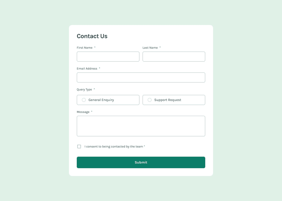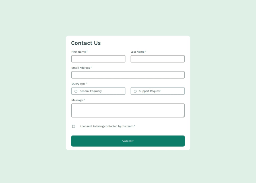
Design comparison
Solution retrospective
I might need to revise my CSS and Javascript codes, they look untidy a bit.
What challenges did you encounter, and how did you overcome them?I had a hard time on JS side, took me a while to figure out why my div did not show up when submit button is clicked and all that...
What specific areas of your project would you like help with?ANY help or feedback is appreciated, thanks in advance :)
Community feedback
- @KapteynUniversePosted 22 days ago
Merhaba Ulaş, great job overall, nice modal animation.
Simple things:
Giving first name input a autofocus might be better for accesibility.
Your error messages and styles are working properly but when i focus one of the input its outline become black by default. Maybe with some pseudo classes like invalid and valid you can show some style so people can understand if the inputs are valid before submitting the form. Funny i checked my own form and i forgot to do this too even tho i did it newsletter sign up before it :D
Marked as helpful1@ul4sfak1rPosted 22 days agoMerhaba @KapteynUniverse! 😊 Thank you so much for your feedback! I'd noticed that some of my input fields were missing responsive border colors, though I can't quite remember why I didn’t address that earlier. This project ended up taking longer than expected—I fell ill partway through, which caused some delays and, unfortunately, led me to lose a bit of enthusiasm. Nonetheless, I’ll definitely go back to fine-tune everything soon!
1
Please log in to post a comment
Log in with GitHubJoin our Discord community
Join thousands of Frontend Mentor community members taking the challenges, sharing resources, helping each other, and chatting about all things front-end!
Join our Discord