Responsive Contact Form, Nested CSS & JS

Solution retrospective
This was pretty new to me as I haven't worked much with contact forms before. The styling wasn't too difficult but getting everything to process correctly was a pain. A lot of the javascript went over my head and I used copilot to aid in much of the JS (which means it works, but probably not very efficiently!).
This was my first project where I leaned heavily into CSS nesting and I like it a lot, it feels like a natural way to do things.
What challenges did you encounter, and how did you overcome them?I had to turn off the form sending as when it sent, the page refreshed and I wasn't able to show the success state. That's something I need to figure out in the future.
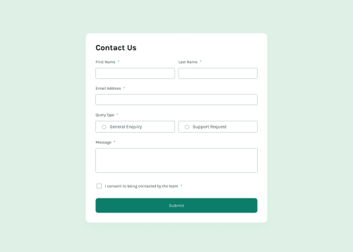
I used accent colours to style the radio and checkbox inputs instead of the provided SVGs (oops).
What specific areas of your project would you like help with?I would like to know what I can do better in terms of accessibility and efficiency. The JS in particular. How can I actually process the form and also show the success state?
Thank you in advance. This was a tough but fun challenge!
Please log in to post a comment
Log in with GitHubCommunity feedback
No feedback yet. Be the first to give feedback on Austin's solution.
Join our Discord community
Join thousands of Frontend Mentor community members taking the challenges, sharing resources, helping each other, and chatting about all things front-end!
Join our Discord